Bar plots are one of the most commonly used tools in data visualization. They are essential for displaying and comparing categorical data. By representing data with rectangular bars, bar plots make it easy to see differences in magnitude between categories. This blog will delve into the importance of bar plots, demonstrate how to create them using R, and explore several variations to highlight their versatility.
Importance of Bar Plots
Comparing Categories. They clearly show differences between categories.
Summarizing Data. They provide a quick summary of data, making them easy to understand.
Displaying Frequencies.They are ideal for displaying frequency distributions of categorical variables.
Highlighting Trends. They can reveal trends when used to compare data across different time periods or groups.
Creating Bar Plots in R
To create bar plots in R, we will use the ggplot2, plotly, sjplot and others packages. Let’s start with a basic bar plot and gradually explore more complex variations.
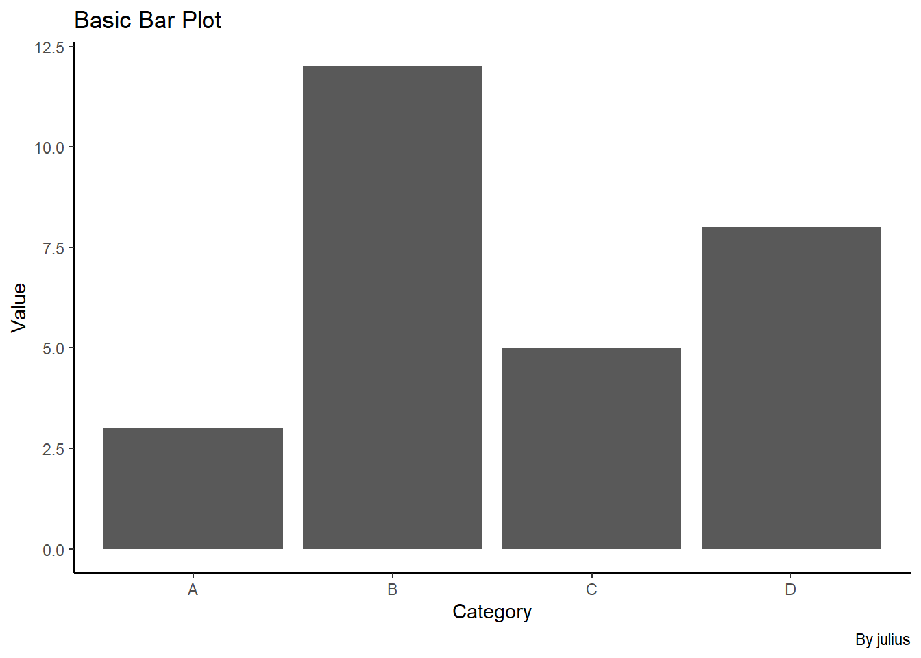
Basic Bar Plot
A basic bar plot is the simplest form of a bar chart, displaying a single series of data points.
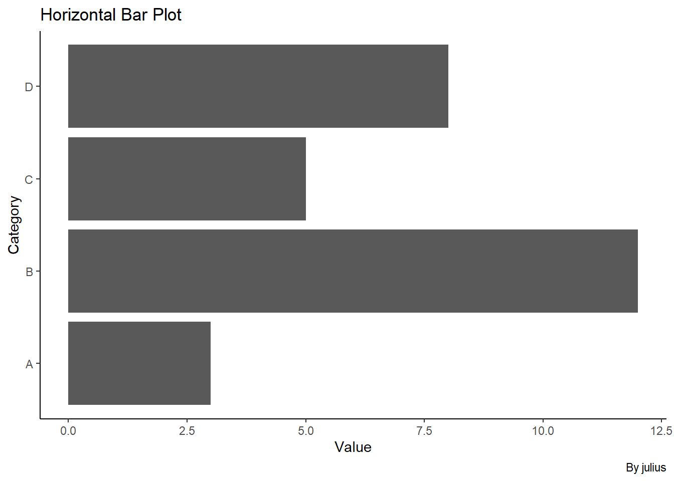
A horizontal bar plot is useful when you have long category names or want to emphasize comparisons across categories.
Code
# Create a horizontal bar plotggplot(data, aes(x =Value, y =Category))+geom_bar(stat ="identity")+labs(title ="Horizontal Bar Plot", x ="Value", y ="Category", caption ="By julius")
Grouped Bar Plot
Grouped bar plots allow us to compare multiple categories within different groups. This is useful for visualizing interactions between two categorical variables.
Code
# Create a sample dataset with groupsdata2<-data.frame( Category =rep(c("A", "B", "C", "D"), 2), Value =c(3, 12, 5, 8, 7, 9, 4, 6), Group =rep(c("Group 1", "Group 2"), each =4))# Create a grouped bar plotggplot(data2, aes(x =Category, y =Value, fill =Group))+geom_bar(stat ="identity", position ="dodge")+labs(title ="Grouped Bar Plot", x ="Category", y ="Value", fill ="Group", caption ="By julius")
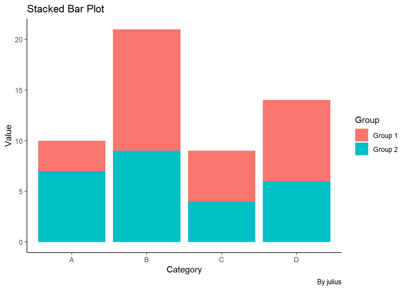
Stacked Bar Plot
Stacked bar plots are used to visualize the composition of each category. They show the relative contribution of each subgroup to the whole.
Code
# Create a stacked bar plotggplot(data2, aes(x =Category, y =Value, fill =Group))+geom_bar(stat ="identity")+labs(title ="Stacked Bar Plot", x ="Category", y ="Value", fill ="Group", caption ="By julius")
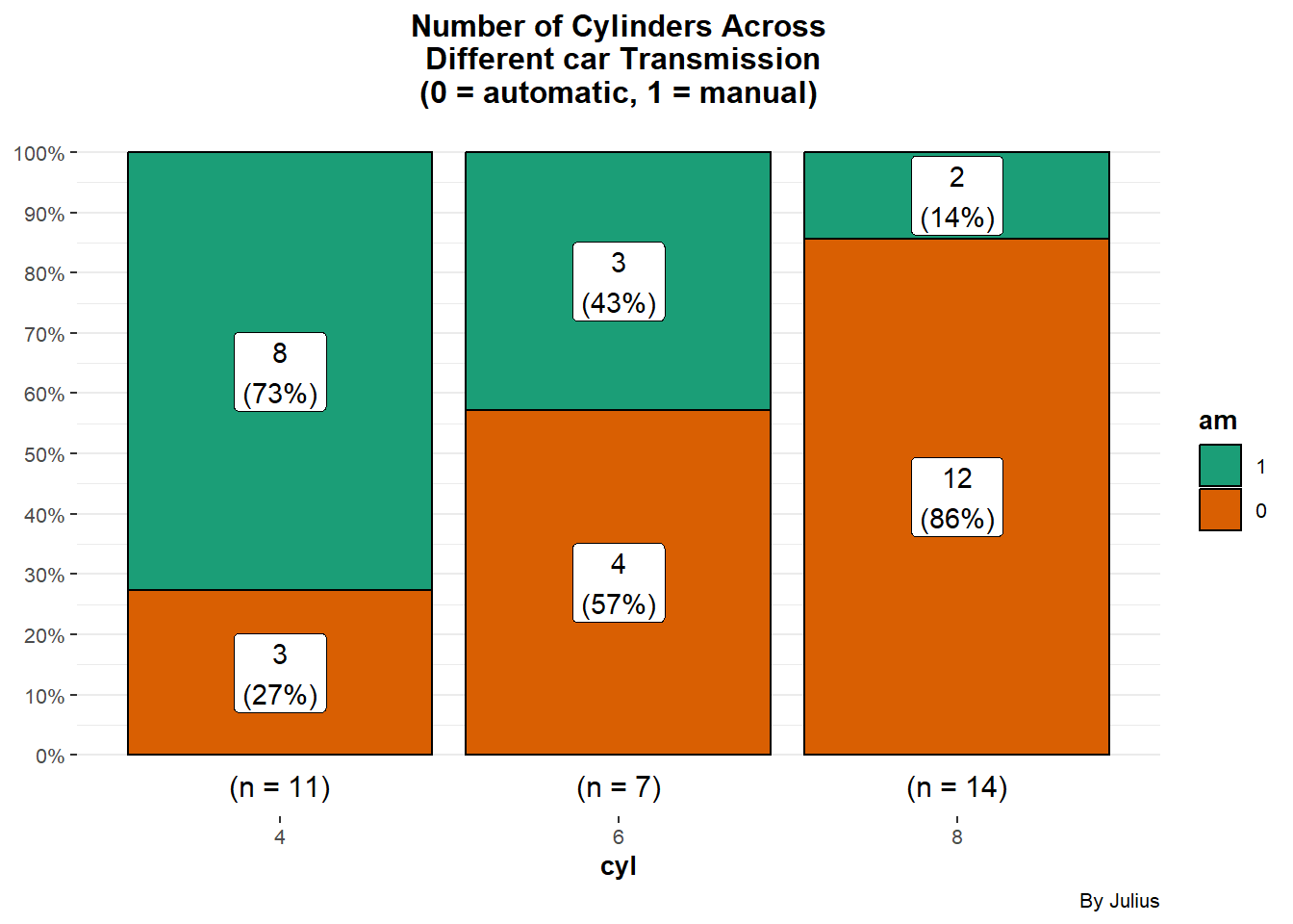
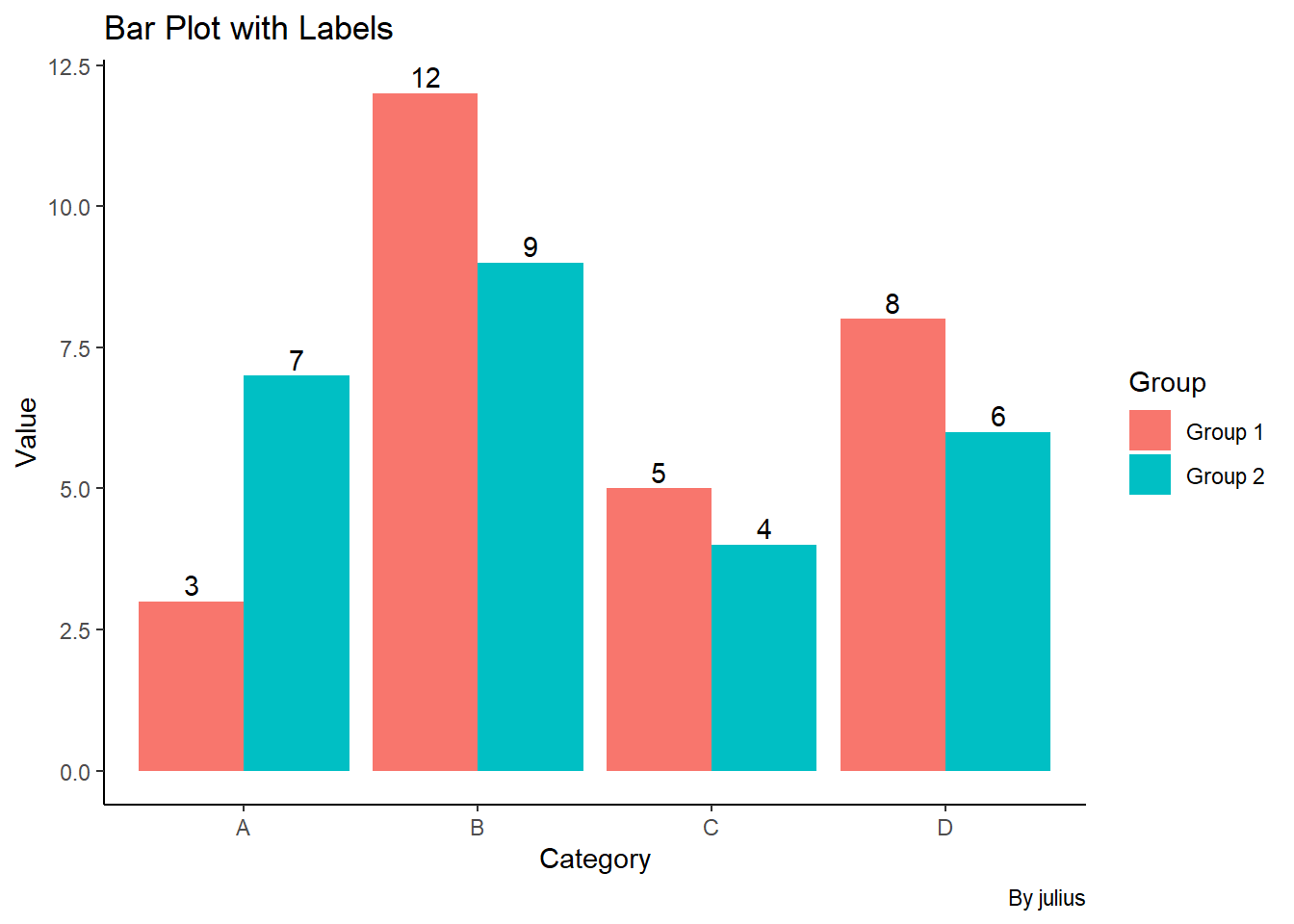
Bar Plot with Labels
Adding labels to bar plots can make them more informative by clearly displaying the values of each bar.
Code
library(ggstatsplot)ggbarstats( data =mtcars, x =am, y =cyl, label ="both", results.subtitle =FALSE)+labs(title ="Number of Cylinders Across\n Different car Transmission\n(0 = automatic, 1 = manual)")+theme(plot.title =element_text(hjust =0.5))+labs(caption ="By Julius")
Code
# Create a bar plot with labelsggplot(data2, aes(x =Category, y =Value, fill =Group))+geom_bar(stat ="identity", position ="dodge")+geom_text(aes(label =Value), vjust =-0.3, position =position_dodge(0.9))+labs(title ="Bar Plot with Labels", x ="Category", y ="Value", fill ="Group", caption ="By julius")
Code
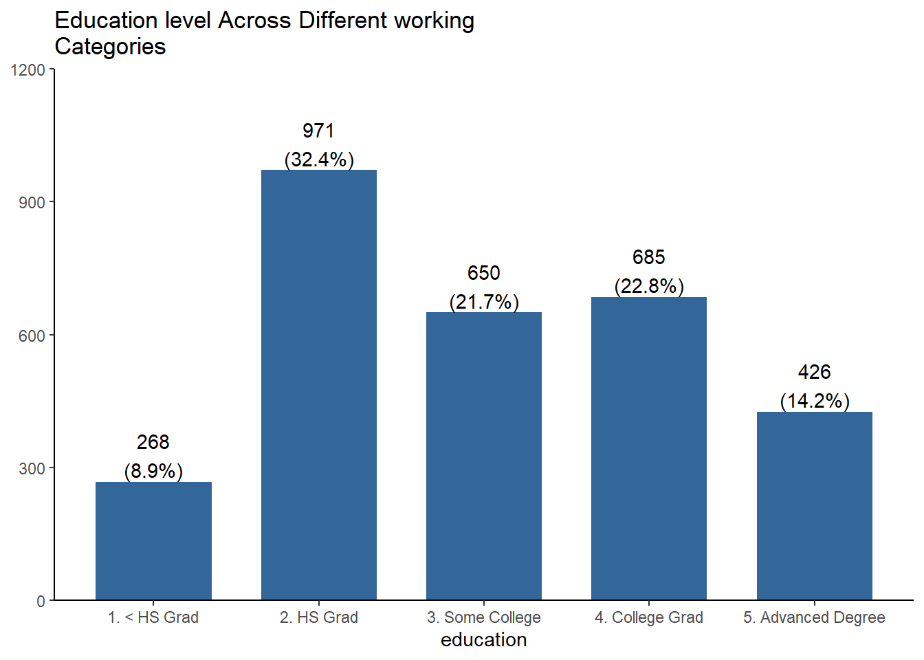
Wage%>%plot_frq(education, title ="Education level Across Different working Categories")
Code
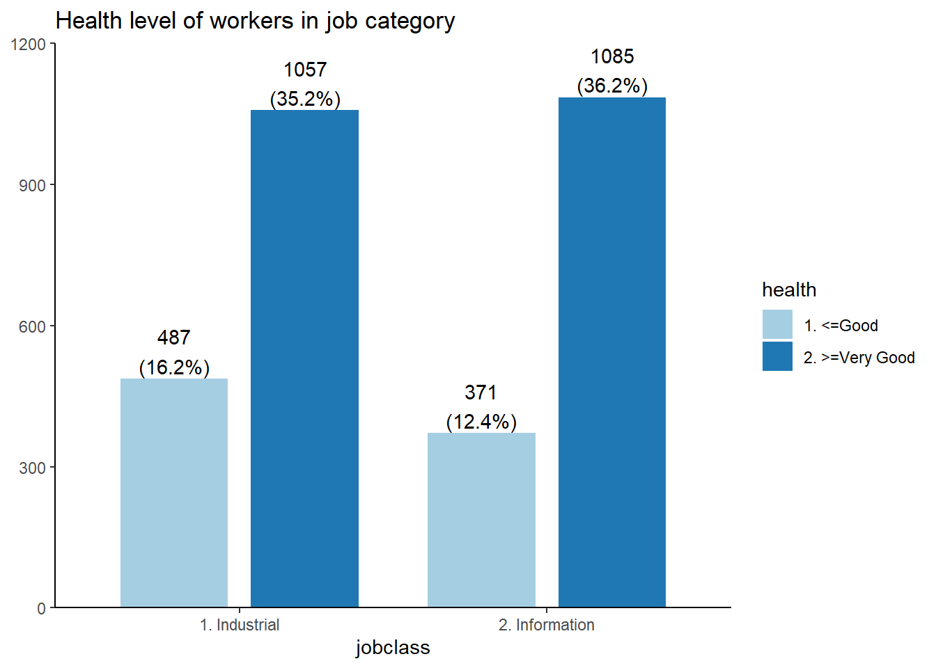
plot_grpfrq(Wage$jobclass, Wage$health, title ="Health level of workers in job category")
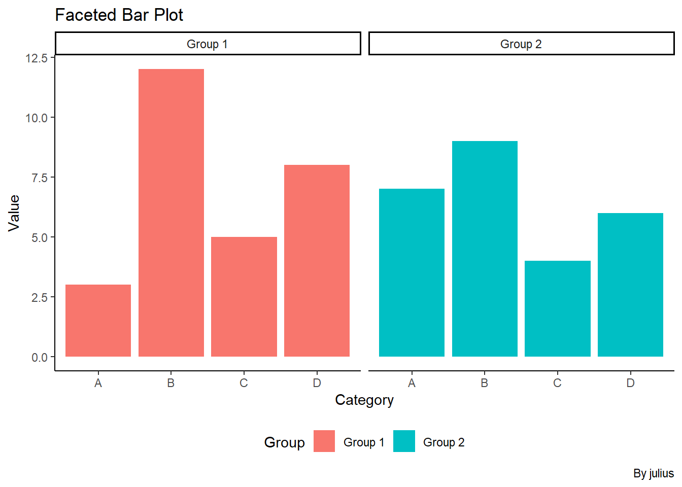
Faceted Bar Plot
Faceting allows us to create multiple panels of plots based on the values of a categorical variable, making it easier to compare different subsets of the data.
Code
# Create a faceted bar plotggplot(data2, aes(x =Category, y =Value, fill =Group))+geom_bar(stat ="identity")+facet_wrap(~Group)+labs(title ="Faceted Bar Plot", x ="Category", y ="Value", fill ="Group", caption ="By julius")+theme(legend.position ="bottom")
Interactive Bar Plots
Interactive bar plots allow users to explore data dynamically by hovering over bars, zooming, and panning. The plotly package can be used to create such interactive visualizations.
Code
library(plotly)# Create an interactive bar plotp<-ggplot(data2, aes(x =Category, y =Value, fill =Group))+geom_bar(stat ="identity")+labs(title ="Interactive Bar Plot", x ="Category", y ="Value", fill ="Group")ggplotly(p)
Conclusion
Bar plots are versatile tools for comparing categorical data, summarizing data distributions, and highlighting trends. By using R and its packages, you can create a variety of bar plots to suit different analytical needs. From basic and grouped bar plots to interactive and faceted ones, each variation enhances data presentation and helps uncover valuable insights.
Mastering these techniques will improve your data visualization skills and enable you to effectively communicate complex data trends to your audience