DASHBOARDS
Introduction to Dashboards
Dashboards play a pivotal role in transforming raw data into meaningful insights, providing a visually intuitive interface for users to interact with complex datasets. Whether in business, healthcare, finance, or any other domain, dashboards serve as powerful tools for decision-makers to monitor key metrics, track performance, and uncover trends. Usually dashboards intends to convey different, but related information in an easy-to-digest form
What are Dashboards?
A dashboard is a visual representation of data, consolidating diverse information into a unified display. It acts as a centralized hub, presenting critical metrics and KPIs (Key Performance Indicators) in real-time or through periodic updates. Dashboards can be static or interactive, allowing users to explore data, filter information, and gain a deeper understanding of the underlying trends.
Importance of Dashboards
- Data Visualization
Dashboards leverage charts, graphs, and other visual elements to present complex datasets in a digestible format. Visualizations enhance data comprehension, making it easier for users to identify patterns, correlations, and outliers.
- Decision-Making
By providing real-time insights, dashboards empower decision-makers to respond promptly to changes in data. Whether monitoring sales performance, tracking project milestones, or assessing financial health, dashboards facilitate informed decision-making.
- Performance Monitoring
Dashboards enable organizations to track and monitor key performance indicators, helping identify areas of success and areas that require attention. This real-time visibility aids in maintaining a proactive approach to organizational goals.
- Customization and Interactivity
Modern dashboards offer customization options, allowing users to tailor the display of data according to their preferences. Interactivity features, such as filtering and drill-down capabilities, enable users to explore specific aspects of the data for a comprehensive analysis.
- User Engagement
Dashboards are designed to be user-friendly and visually appealing, promoting engagement with data. A well-crafted dashboard invites exploration and fosters a deeper connection with the underlying information.
Types of Dashboards:
- Operational Dashboards
Focus on day-to-day operations, displaying real-time data relevant to ongoing processes. Commonly used in industries like manufacturing and logistics.
- Strategic Dashboards
Align with organizational strategies, providing a high-level overview of key performance indicators and long-term goals. Suitable for executive-level decision-makers.
- Analytical Dashboards
Allow users to delve into the details, exploring data sets and conducting in-depth analysis. Commonly used in data-driven industries such as finance and research.
Basic procedure of creating a dashboard:
- Define your audience and goals
Understanding who will use the dashboard and what information they need to derive from it will guide you in creating a more effective and user-centric visualization.
- Choose your data
Refers to the selection and preparation of the dataset that will be visualized on the dashboard.
- Choose your visualization
The choice of visualization depends on the nature of your data and the story you want to tell.
Keep it simple. Make it as simple as possible for an easy understanding.
Get feedback from your audience.
Examples
The following are examples created using flexdashboard in r studio
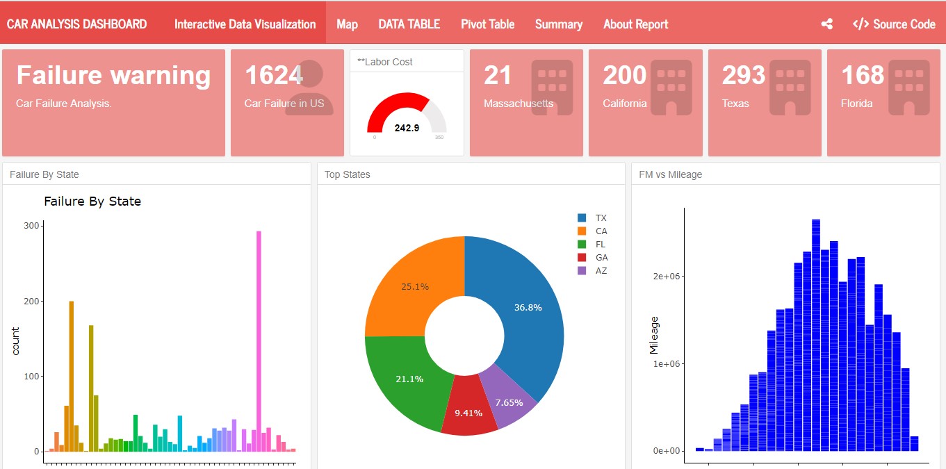
Car Falure Analysis i n US
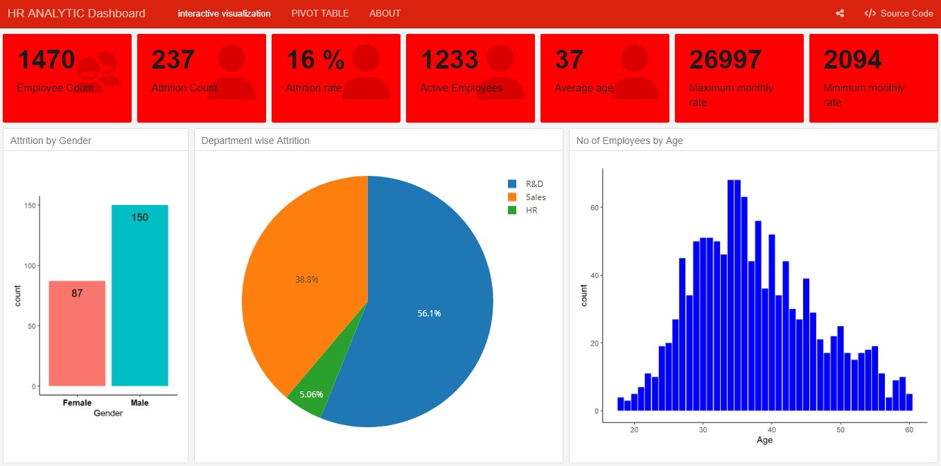
HR Analytics Dashboard
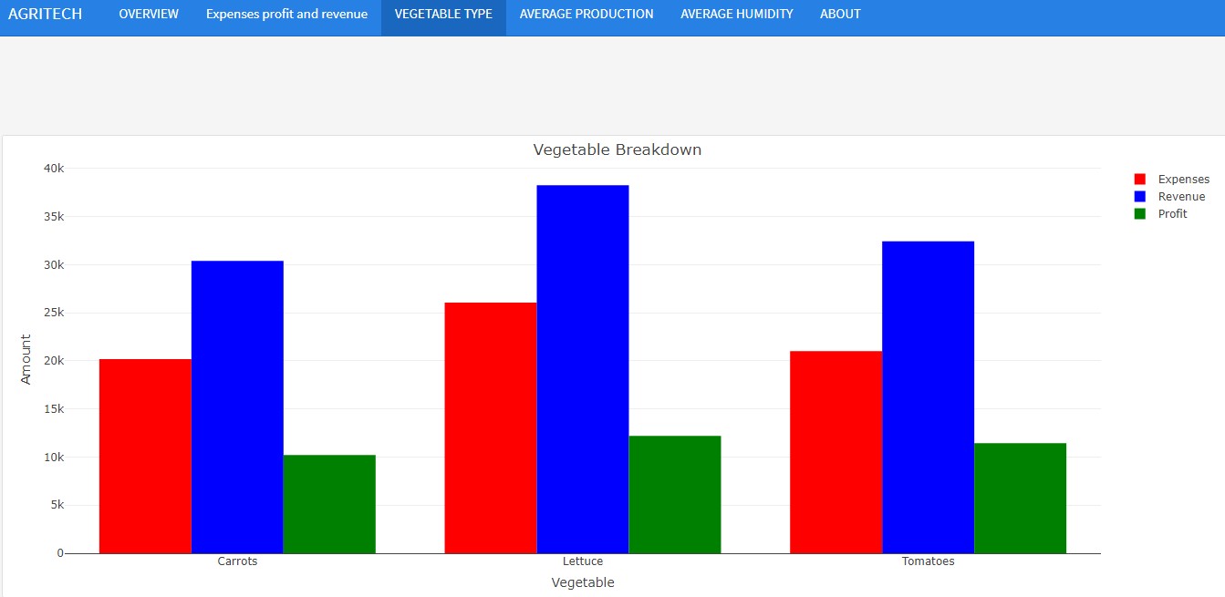
Farm Dashboard
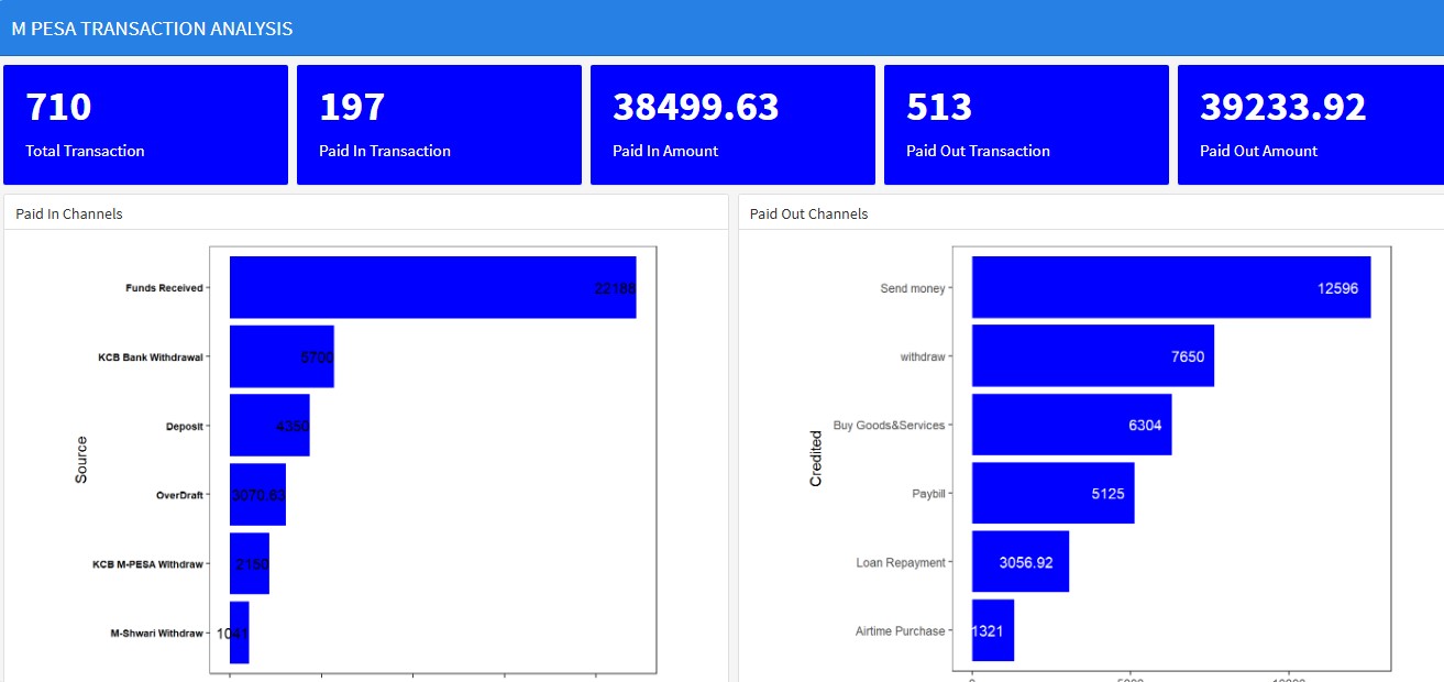
M Pesa Transaction Dashboard