Data Visualization with Box Plots in R
Introduction
A box plot is a standardize ay of displaying the distribution of data based on a five-number summary:minimum, first quartile(Q1),median, third quartile (Q3) and maximum. its is particularly useful for identifying outliers and comparing distributions
A box plot consists of several key elements, each contributing to the overall representation of the data:
- Box:
The central rectangle represents the interquartile range (IQR), encompassing the middle 50% of the data. The length of the box signifies the spread of this central portion.
- Median Line:
A vertical line within the box marks the median, showcasing the central tendency of the dataset.
- Whiskers:
Lines extending from the box, known as whiskers, depict the range of the data outside the interquartile range. They can be indicative of the overall spread of the dataset.
- Outliers:
Individual data points lying beyond the whiskers are considered outliers, potentially signifying unique or extreme values.
Importance
- Decision Support in Statistics:
Box plots serve as decision support tools, aiding researchers, analysts, and decision-makers in gaining a holistic understanding of the data’s characteristics. They are particularly valuable in scenarios where a quick but informative summary of the distribution is needed.
- Revealing Data Distribution:
One of the primary strengths of box plots is their ability to visually represent the distribution of data. The box itself provides a clear indication of where the bulk of the data resides, with the median offering insight into the central tendency. The whiskers extend this representation, offering a glimpse into the variability and potential skewness of the dataset.
Loading the package
Code
ggplot(mpg, aes(x = class, y = displ))+geom_boxplot()+annotate("text",x = 1,y = 3, label = "Skewed", color = "red")+ geom_segment(
  x = 1, y = 3, xend = 1.6, yend = 2.3, arrow = arrow(length = unit(0.7,"cm")), size = 1
)+ labs(title = "Example of skewed distribution")+
  geom_segment( x = 5.5, y = 6.5, xend = 6.8, yend = 5, arrow = arrow(length = unit(0.7,"cm")), size = 1)+annotate("text",x = 5,y = 7, label = "Normal distribution", color = "red")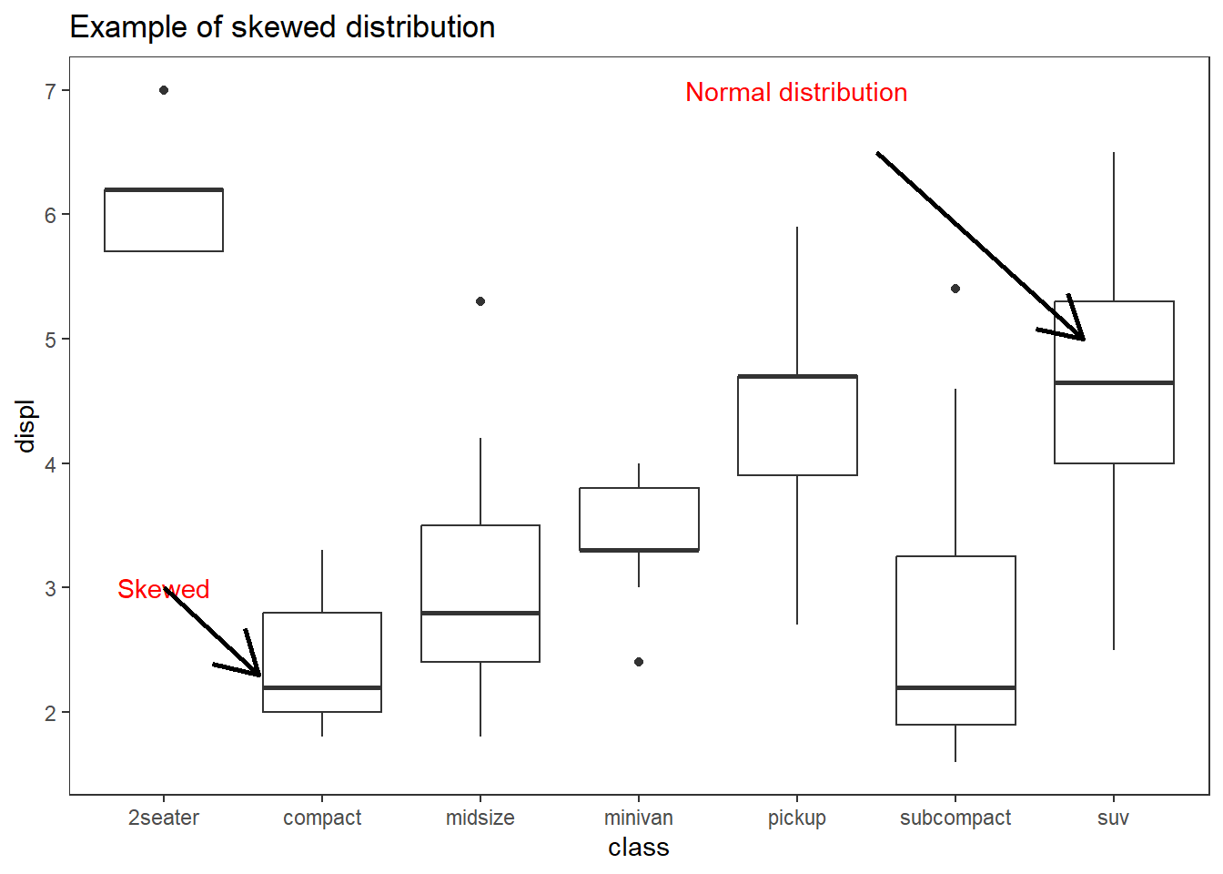
- Comparing Distributions:
Box plots shine in comparative analyses, allowing for the visual juxtaposition of multiple datasets. Whether comparing the performance of different groups, assessing the impact of interventions, or studying the distributional differences between variables, box plots provide a concise and informative display.
Code
ggplot(mpg, aes(x = class, y = displ))+geom_boxplot()+labs(title = "Comparison of distribution in different groups")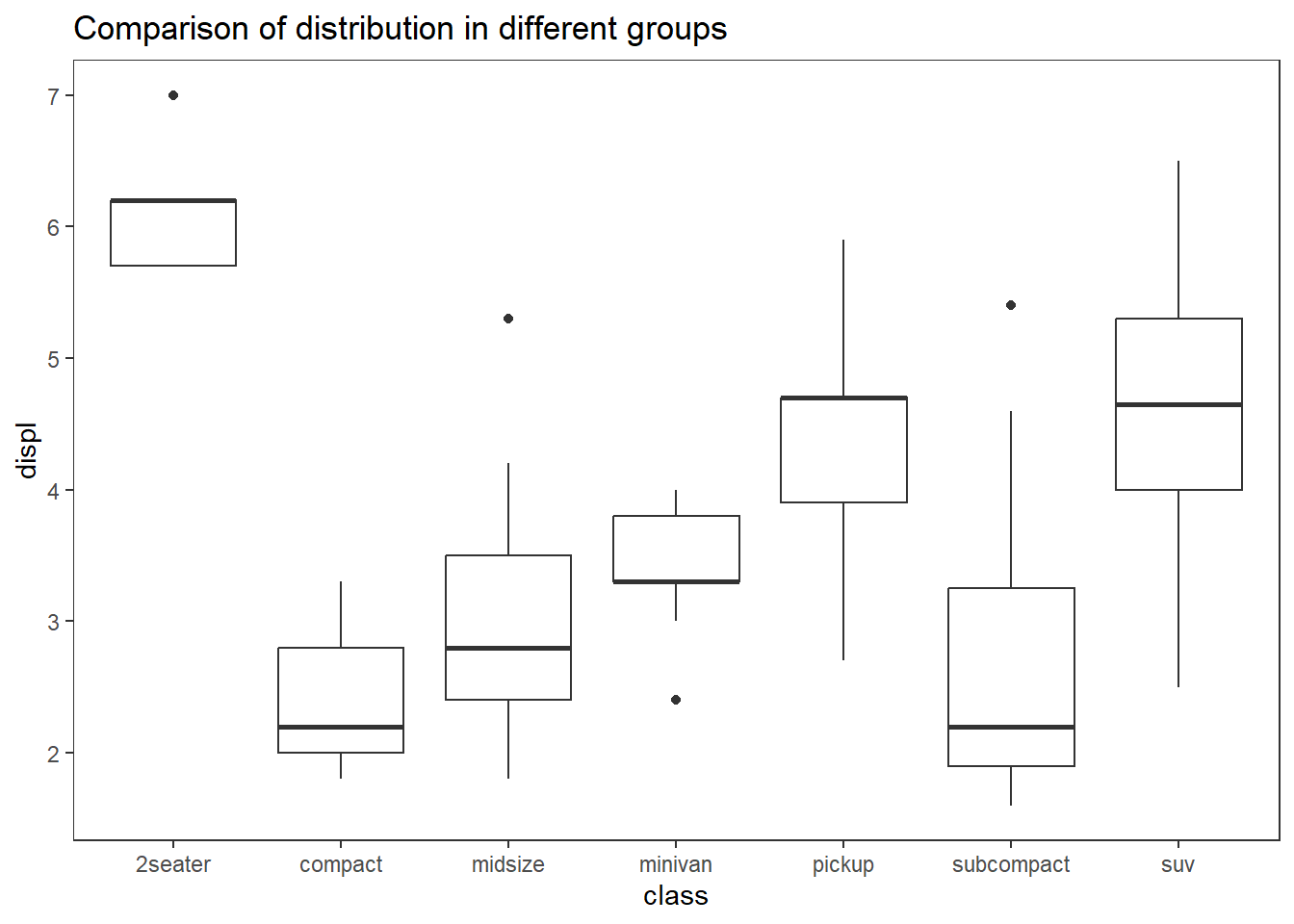
- Identifying Outliers:
The presence of outliers, those data points lying outside the whiskers, becomes immediately apparent in a box plot. This feature aids in the identification of potential anomalies or extreme values that might significantly impact the interpretation of the dataset.
Code
ggplot(mpg, aes(x = class, y = displ))+geom_boxplot()+annotate("text",x = 3,y = 5.5, label = "outlier")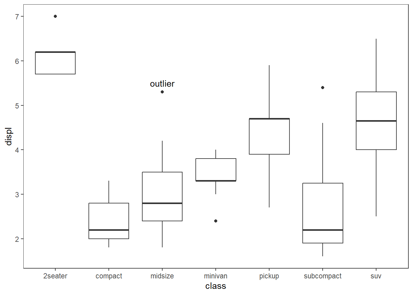
More Example of Boxplot
Code
# Create a boxplot of miles per gallon (mpg) by number of cylinders (cyl)
ggplot(mtcars, aes(factor(cyl), mpg)) +
  geom_boxplot(fill = "skyblue", color = "blue") +
  labs(title = "Boxplot of MPG by Number of Cylinders",
       x = "Number of Cylinders",
       y = "Miles per Gallon")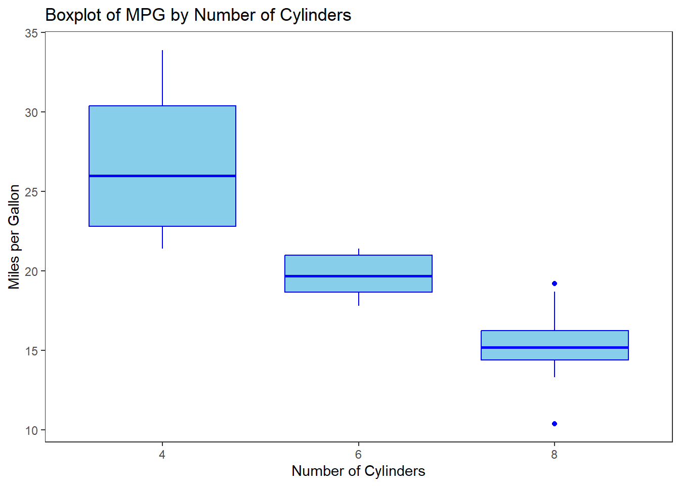
Code
# Create a boxplot of miles per gallon (mpg) by number of cylinders (cyl)
# Fill color based on the type of carburetor (carb)
ggplot(mtcars, aes(factor(cyl), mpg, fill = factor(carb))) +
  geom_boxplot() +
  scale_fill_manual(values = c("1" = "skyblue", "2" = "salmon", "3" = "lightgreen", "4" = "purple", "6" = "orange", "8" = "yellow")) +  # Define fill colors for each carburetor type
  labs(title = "Boxplot of MPG by Number of Cylinders and Carburetor Type",
       x = "Number of Cylinders",
       y = "Miles per Gallon",
       fill = "Carburetor Type")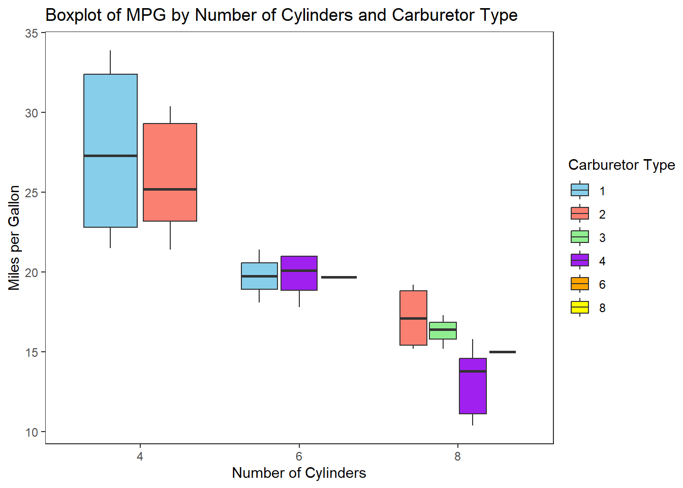
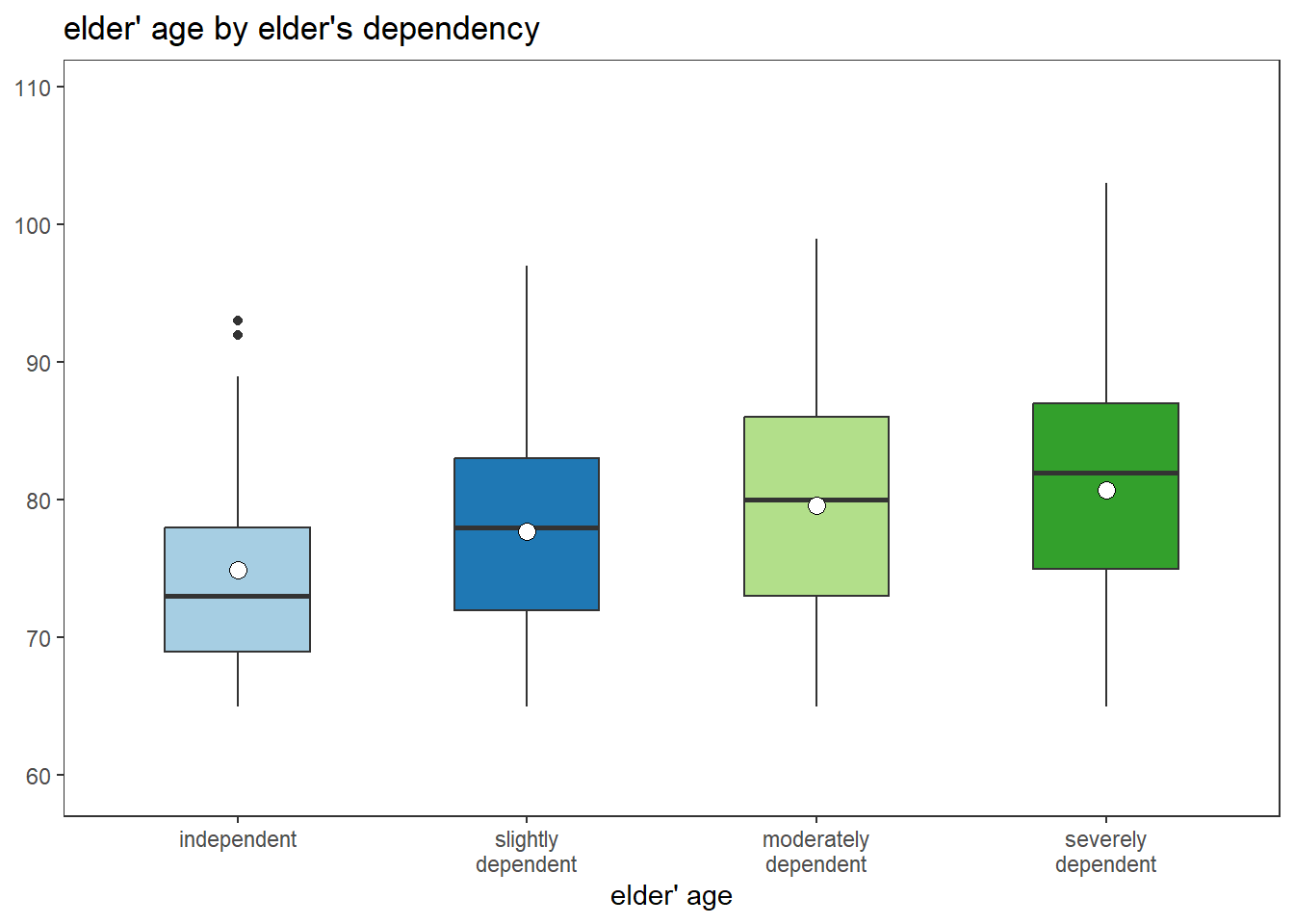
Code
library(sjPlot)
data("efc")
plot_grpfrq(efc$e17age, efc$e42dep, type = "box")