Data Visualization with Histograms in R
Introduction
Histograms stand out as powerful tools for understanding the distribution and frequency of a single variable. These visual representations distill complex datasets into insightful patterns, providing a quick and intuitive grasp of the underlying structure. Let’s explore the significance of histograms and their role in revealing the stories hidden within data distributions.
The Essence of Histograms:
A histogram is a graphical representation that displays the distribution of a dataset. It achieves this by dividing the data into intervals, or bins, and representing the frequency or count of data points falling into each bin with the height of corresponding bars. The bars are typically contiguous, creating a visual depiction of the distribution’s shape.
Visualizing Data Distribution:
Histograms excel at illustrating the distribution of a single variable, offering an immediate sense of the data’s central tendency, spread, and skewness. Whether the distribution is normal, skewed or uniform, a well-constructed histogram provides visual cues that go beyond the numbers themselves.
Choosing Appropriate Bin Width:
The selection of bin width plays a crucial role in the interpretability of histograms. Too narrow bins may result in noise, obscuring the underlying pattern, while overly wide bins might oversimplify the distribution. Striking the right balance is essential for creating a histogram that accurately reflects the characteristics of the data.
Identifying Peaks and Tails:
Histograms effectively highlight peaks and tails in the distribution. Peaks indicate modes or clusters within the data, while tails reveal the presence of outliers or extreme values. This visual distinction aids in identifying key features that may influence subsequent analyses or decision-making processes.
Comparative Analysis:
Histograms are invaluable for comparative analyses. When comparing two or more datasets, overlaying multiple histograms on the same graph allows for a quick assessment of similarities, differences, or shifts in distribution. This is particularly useful in fields such as medicine, finance, and social sciences.
Area as a Proportional Measure:
The area of each bar in a histogram represents the proportion of data falling within the corresponding bin. This feature makes histograms suitable for comparing the relative sizes of different categories or intervals, providing a clear understanding of the dataset’s composition.
Real-World Applications:
Histograms find applications in various domains, from quality control in manufacturing to demographic analysis in social sciences. In finance, they help analyze the distribution of stock returns, while in biology, histograms aid in understanding the distribution of species across habitats.
Creating Histograms in R
To create histograms in R, we will use the ggplot2 package. Let’s start with a basic histogram and gradually explore more complex variations.
Basic Histogram
A basic histogram displays the frequency distribution of a single variable.
Loading Package
Code
# Create a sample dataset
set.seed(123)
data2 <- data.frame(
  Value = c(rnorm(100, mean = 50, sd = 10))
)

# Create a basic histogram
ggplot(data2, aes(x = Value)) +
  geom_histogram(binwidth = 5, fill = "blue", color = "black") +
  labs(title = "Basic Histogram",
       x = "Value",
       y = "Frequency")
Histogram with Different Bin Widths
The choice of bin width can significantly affect the appearance and interpretability of a histogram. Experimenting with different bin widths can help reveal different aspects of the data distribution.
Code
# Create a histogram with different bin widths
ggplot(data2, aes(x = Value)) +
  geom_histogram(binwidth = 2, fill = "green", color = "black") +
  labs(title = "Histogram with Bin Width 2",
       x = "Value",
       y = "Frequency") +
  theme_minimal()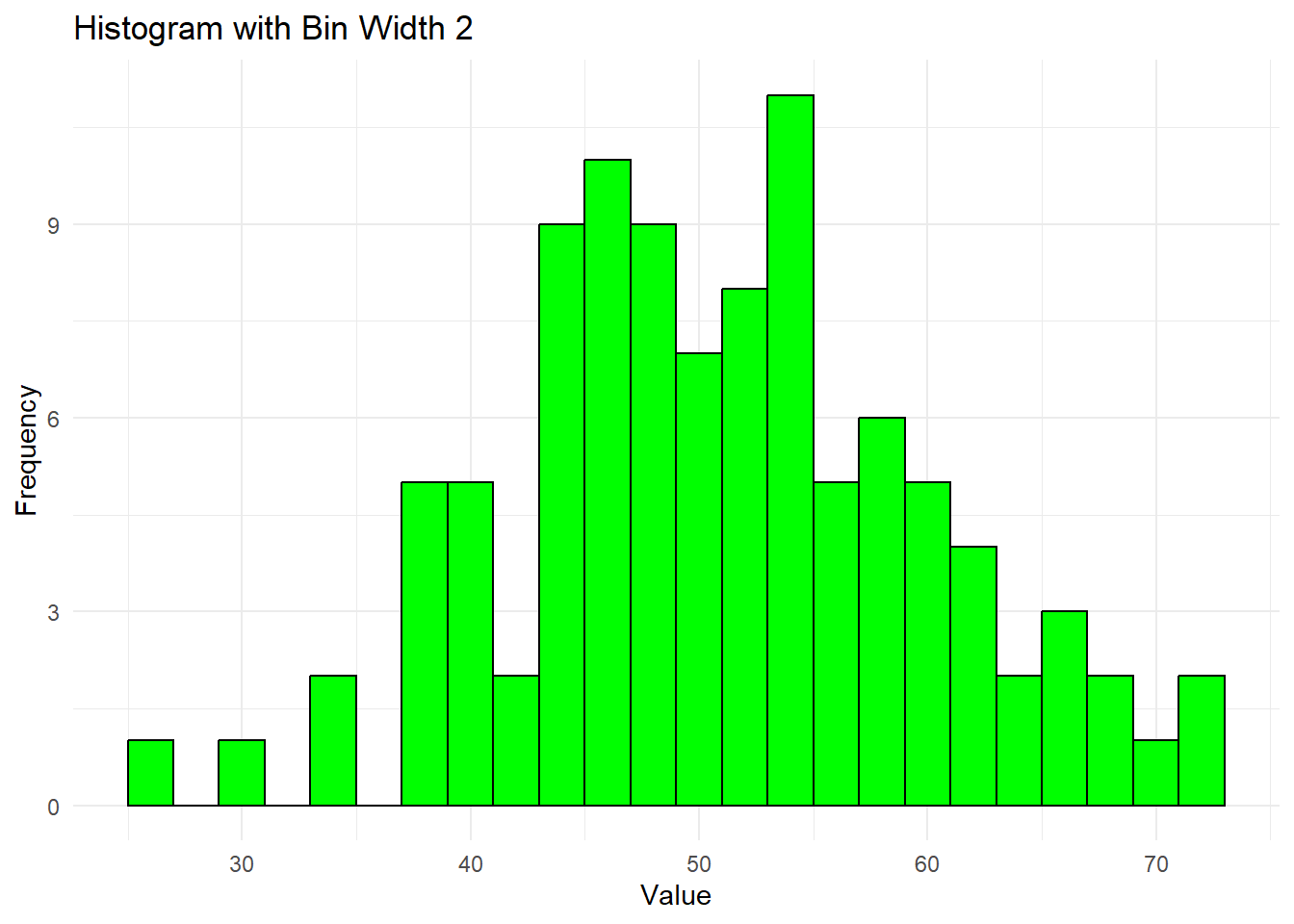
Code
ggplot(data2, aes(x = Value)) +
  geom_histogram(binwidth = 10, fill = "red", color = "black") +
  labs(title = "Histogram with Bin Width 10",
       x = "Value",
       y = "Frequency") +
  theme_minimal()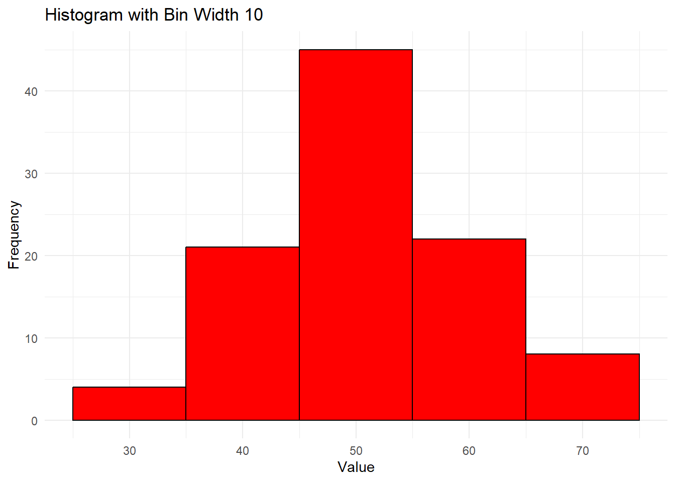
Colored Histogram
Using different colors can enhance the visual appeal of histograms and help differentiate between multiple distributions.
Code
# Create a colored histogram
ggplot(data2, aes(x = Value, fill = ..count..)) +
  geom_histogram(binwidth = 5, color = "black") +
  scale_fill_gradient("Frequency", low = "yellow", high = "red") +
  labs(title = "Colored Histogram",
       x = "Value",
       y = "Frequency") +
  theme_minimal()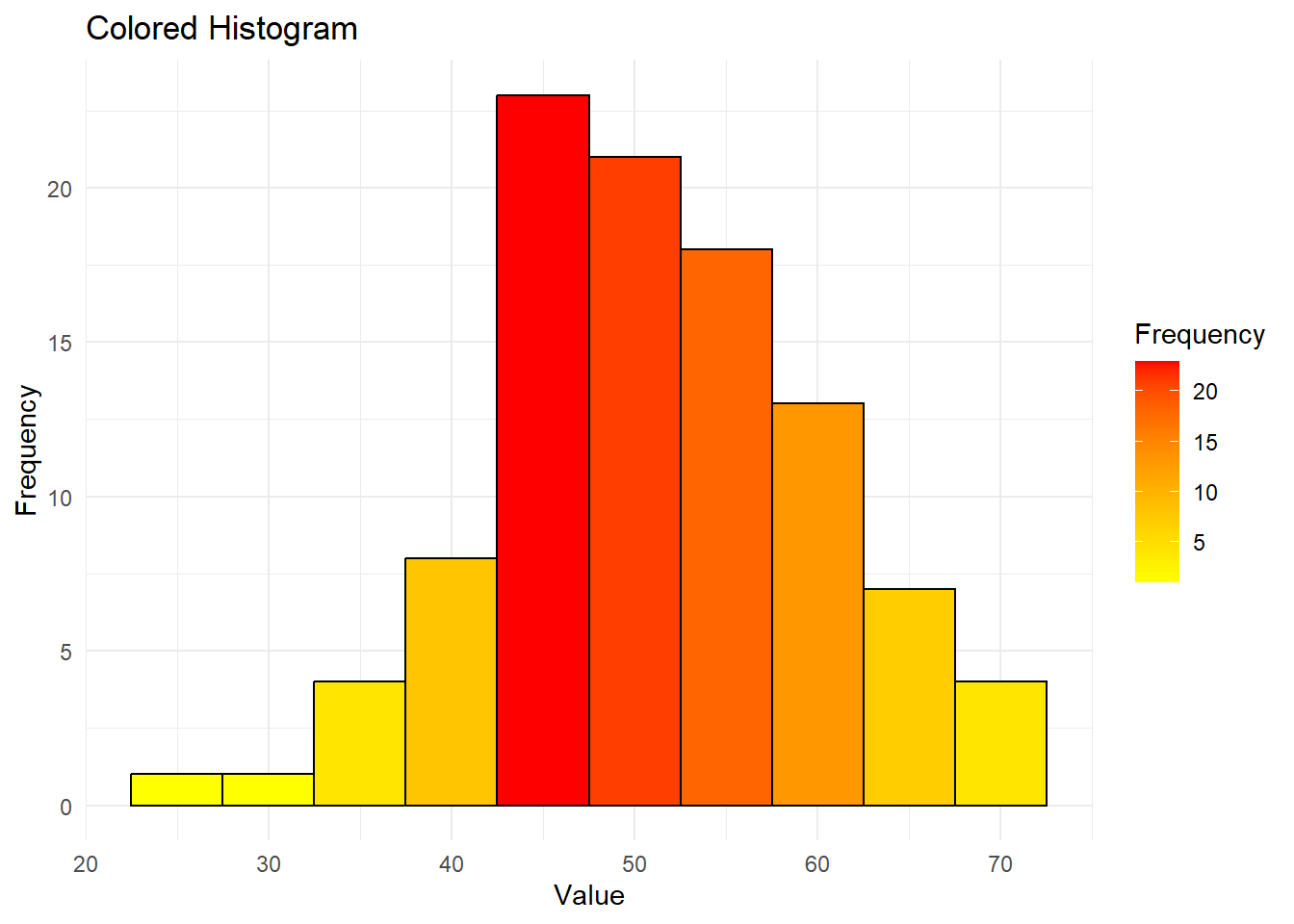
Faceted Histogram
Faceting allows the creation of multiple panels of histograms based on the values of a categorical variable, making it easier to compare different subsets of the data.
Code
# Create a sample dataset with groups
data3 <- data.frame(
  Value = c(rnorm(100, mean = 50, sd = 10),
            rnorm(100, mean = 60, sd = 15)),
  Group = rep(c("Group 1", "Group 2"), each = 100)
)

# Create a faceted histogram
ggplot(data3, aes(x = Value)) +
  geom_histogram(binwidth = 5, fill = "blue", color = "black") +
  facet_wrap(~ Group) +
  labs(title = "Faceted Histogram",
       x = "Value",
       y = "Frequency") +
  theme_minimal()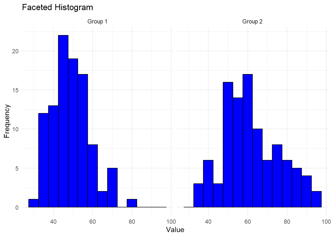
Compare Distribution of Several Groups
Code
library(ISLR)
Wage %>%
  ggplot(aes(wage,fill=jobclass
  ))+geom_histogram()+
  facet_wrap(~education,scales = "free")+
  theme(legend.position = "bottom")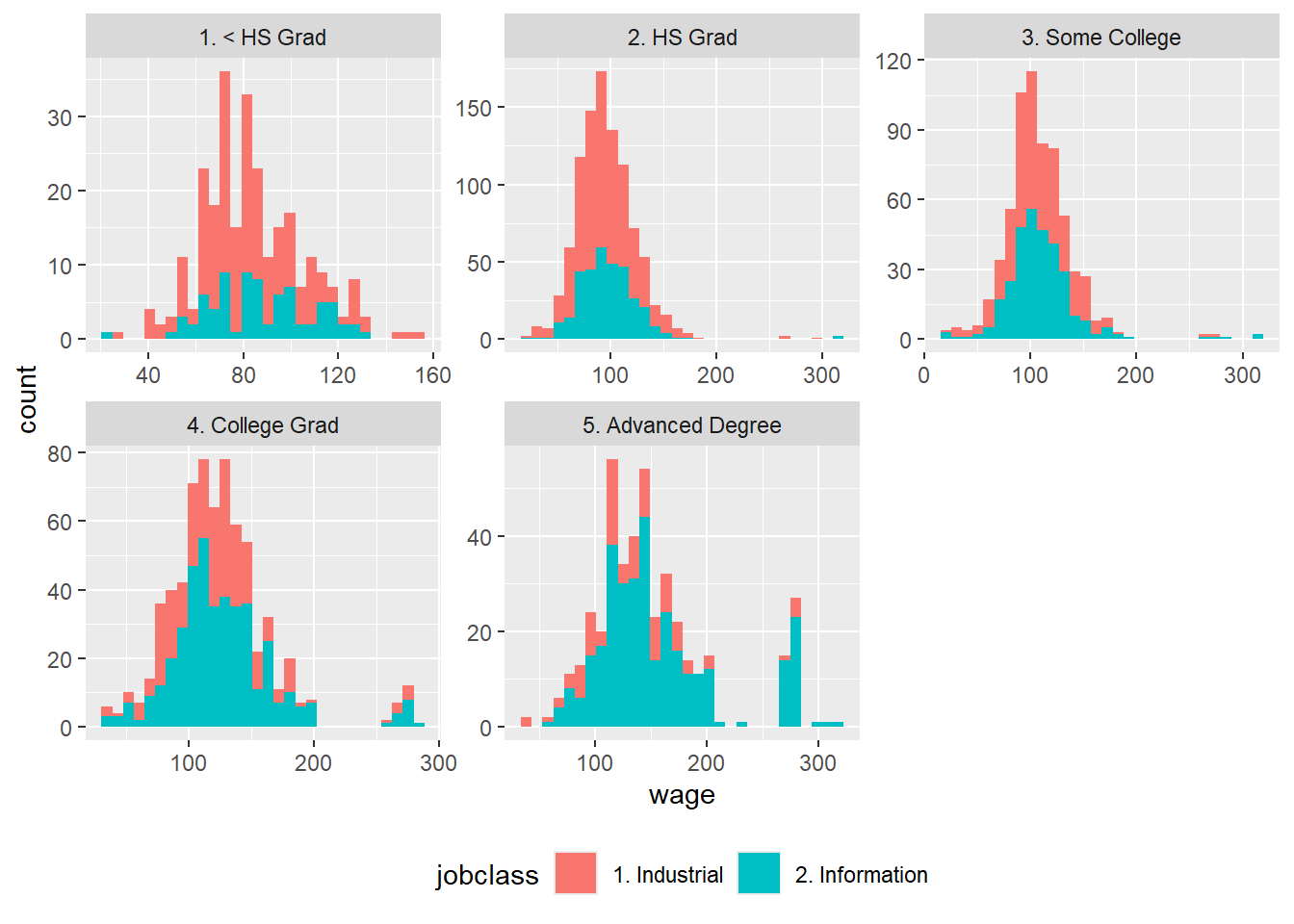
Density Plot Overlay
Overlaying a density plot on a histogram provides additional insight into the data distribution by smoothing out the frequency distribution.
Code
# Create a histogram with a density plot overlay
ggplot(data2, aes(x = Value)) +
  geom_histogram(aes(y = ..density..), binwidth = 5, fill = "blue", color = "black", alpha = 0.5) +
  geom_density(color = "red", size = 1) +
  labs(title = "Histogram with Density Plot Overlay",
       x = "Value",
       y = "Density") +
  theme_minimal()
Warning: Using `size` aesthetic for lines was deprecated in ggplot2 3.4.0.
ℹ Please use `linewidth` instead.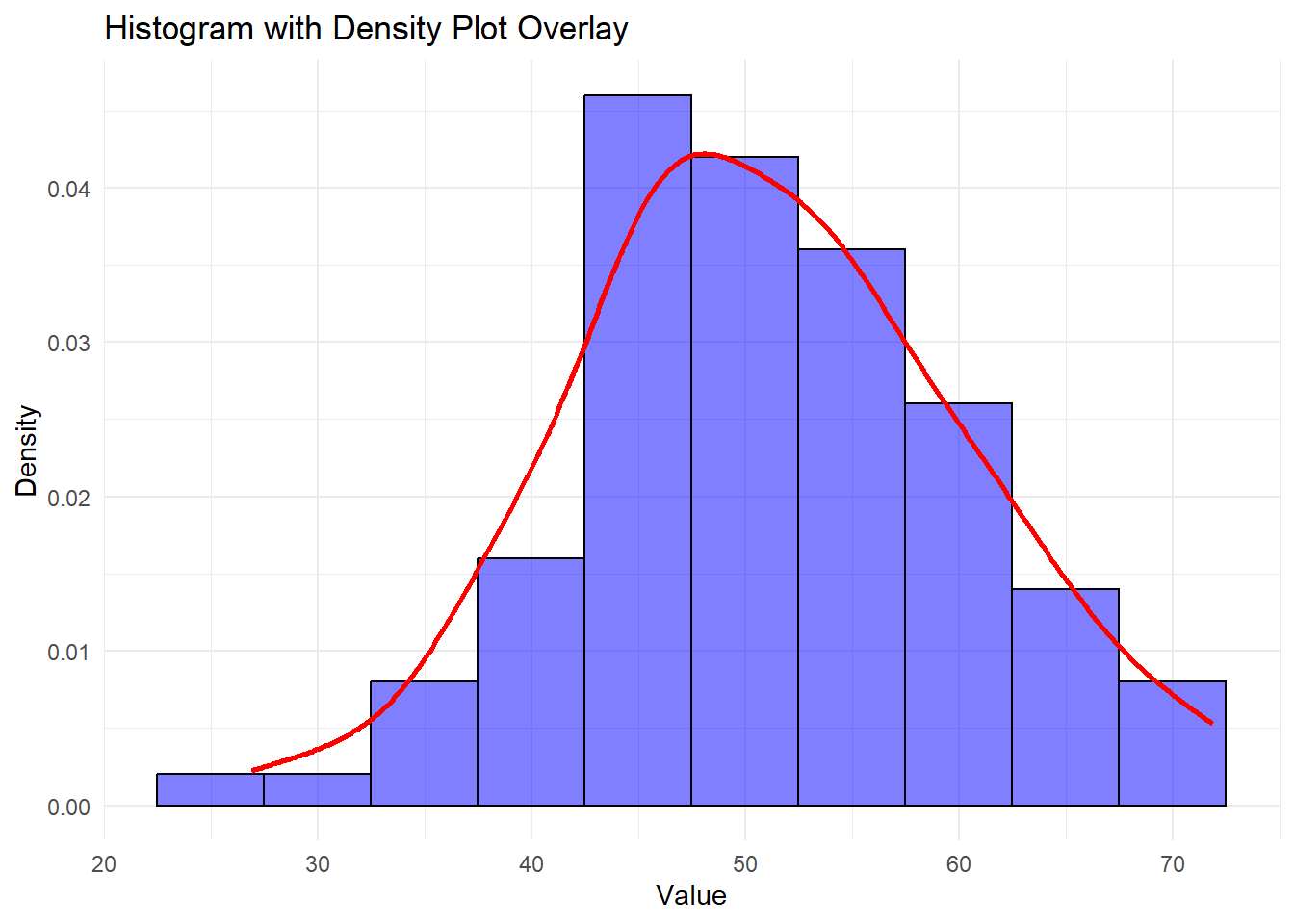
Adding central tendancy
Code
ggplot(data2, aes(x = Value)) +
  geom_histogram(binwidth = 5, fill = "blue", color = "black") +
  geom_vline(aes(xintercept = mean(Value)), color = "red",
             size = 1, linetype = "dashed")+
  labs(title = "Histogram showing the mean",
       x = "Value",
       y = "Frequency")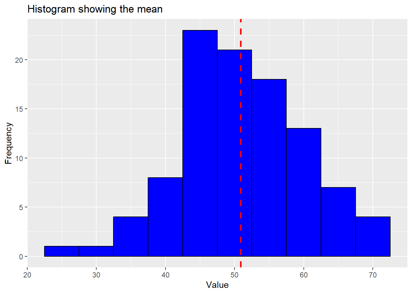
Identifying outliers
Code
ggplot(data = Wage,
       aes(wage))+geom_histogram(fill = "blue", color = "white")+
  annotate("rect", xmin = 250, xmax = 320, ymin = 0, ymax = 100,
               alpha = .2)+
   annotate("text", x = 280, y = 80, label = "Outliers")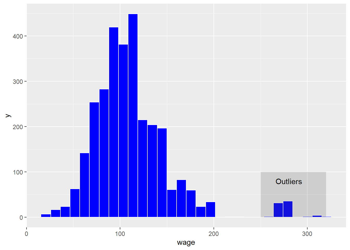
Interactive Histograms
Interactive histograms enable users to explore data dynamically by hovering over bins, zooming, and panning. The plotly package can be used to create such interactive visualizations.
Code
library(plotly)

# Create an interactive histogram
p <- ggplot(data2, aes(x = Value)) +
  geom_histogram(binwidth = 5, fill = "blue", color = "black") +
  labs(title = "Interactive Histogram",
       x = "Value",
       y = "Frequency") +
  theme_minimal()

ggplotly(p)
Conclusion
Histograms are powerful tools for understanding data distributions, identifying outliers, and analyzing frequency. By using R and the ggplot2 package, you can create a variety of histograms to suit different analytical needs. From basic and colored histograms to interactive and faceted ones, each variation enhances data presentation and helps uncover valuable insights.