In the realm of data visualization, line graphs hold a prominent position due to their ability to effectively depict trends over time. Line graphs, also known as line charts, are a type of chart used to visualize data points connected by straight lines. They are particularly useful for showing changes and trends across a continuous variable, often time.
Importance of Line Graphs
Line graphs are indispensable tools for
Tracking Trends Over Time: They provide a clear visual representation of how data evolves over a specific period.
Comparing Multiple Data Sets: Multiple line graphs can be plotted together to compare different data series.
Highlighting Fluctuations: Line graphs can effectively highlight fluctuations, patterns, and outliers within the data.
Presenting Data Clearly: They are straightforward and easy to interpret, making them suitable for a wide range of audiences.
Creating Line Graphs in R
To create line graphs in R, we will use the ggplot2 package, which is part of the tidyverse suite of packages. Let’s explore various types of line graphs, starting with a basic one and moving towards more complex variations.
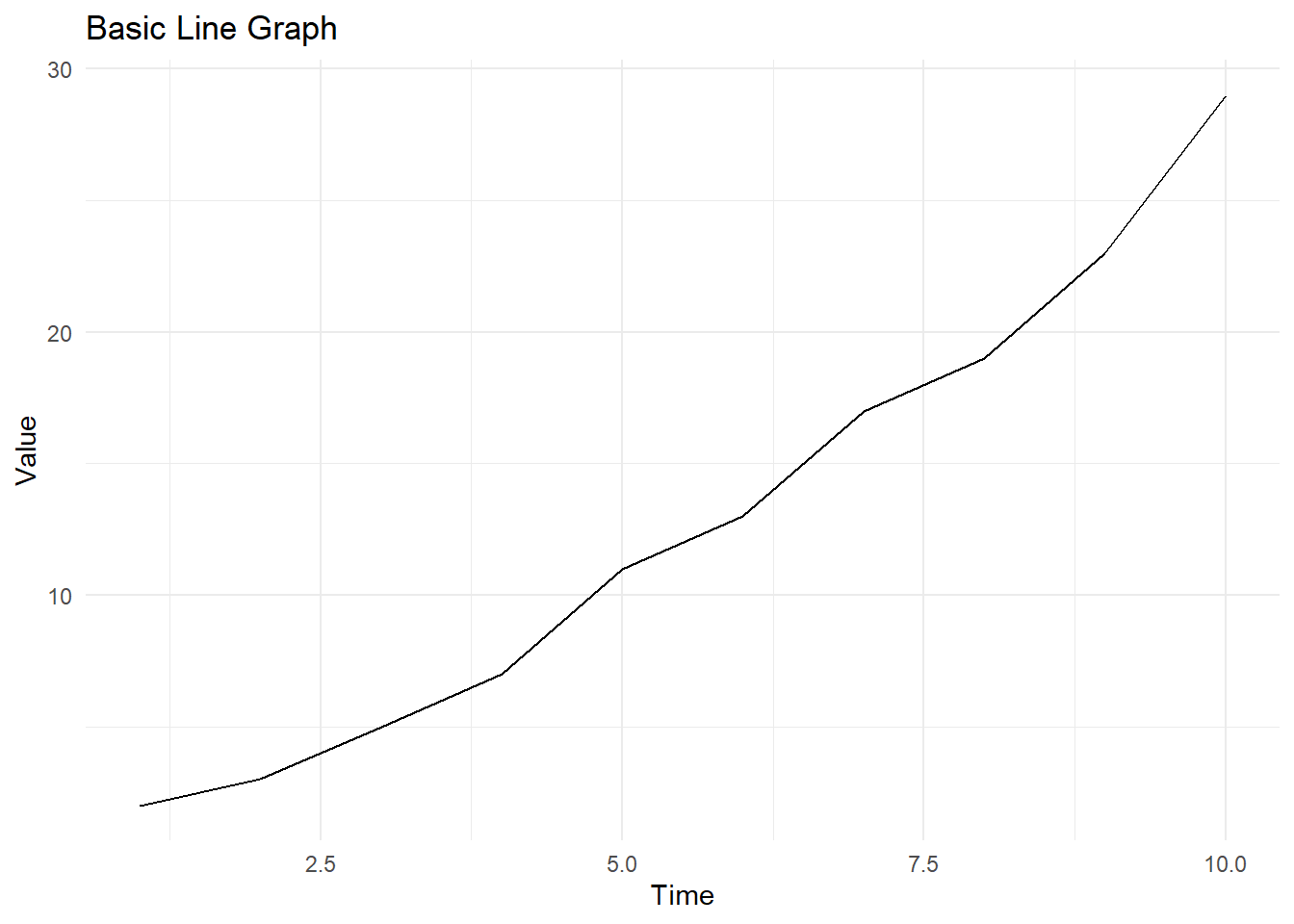
Basic Line Graph
A basic line graph is the simplest form of a line chart, depicting a single series of data points connected by lines.
Code
library(tidyverse)# Create a sample datasetdata<-data.frame( Time =1:10, Value =c(2, 3, 5, 7, 11, 13, 17, 19, 23, 29))# Create a basic line graphggplot(data, aes(x =Time, y =Value))+geom_line()+labs(title ="Basic Line Graph", x ="Time", y ="Value")+theme_minimal()
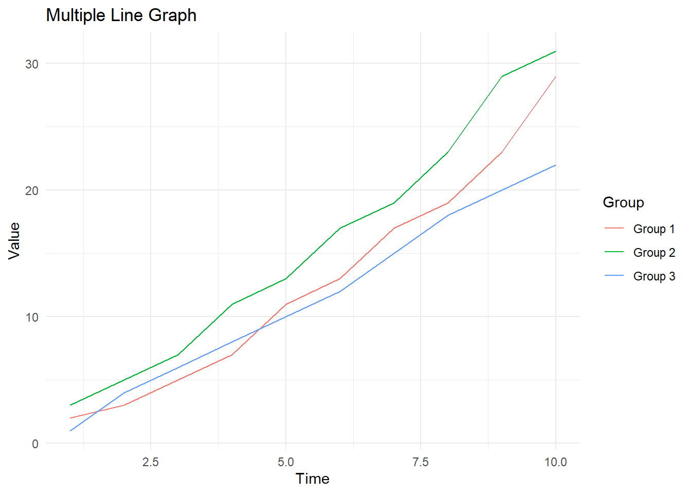
Multiple Line Graphs
Multiple line graphs allow us to compare more than one data series on the same plot by using different colors or line types.
Code
# Create a sample dataset with multiple groupsdata2<-data.frame( Time =rep(1:10, 3), Value =c(2, 3, 5, 7, 11, 13, 17, 19, 23, 29,3, 5, 7, 11, 13, 17, 19, 23, 29, 31,1, 4, 6, 8, 10, 12, 15, 18, 20, 22), Group =rep(c("Group 1", "Group 2", "Group 3"), each =10))# Create a multiple line graphggplot(data2, aes(x =Time, y =Value, color =Group))+geom_line()+labs(title ="Multiple Line Graph", x ="Time", y ="Value", color ="Group")+theme_minimal()
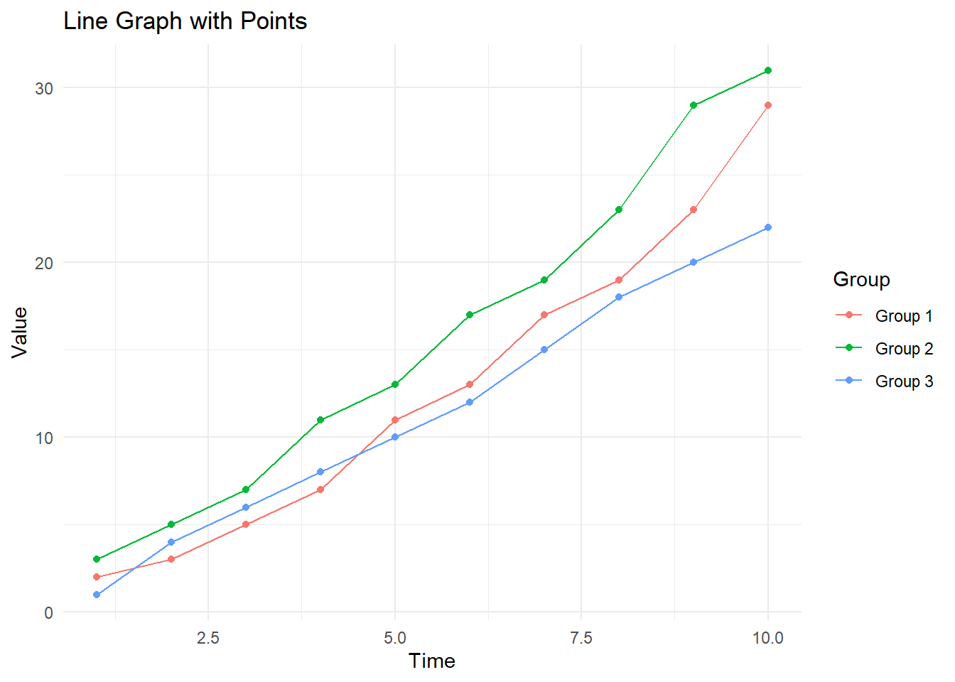
Line Graph with Points
Adding points to a line graph can highlight specific data points, making the graph more informative.
Code
# Create a line graph with pointsggplot(data2, aes(x =Time, y =Value, color =Group))+geom_line()+geom_point()+labs(title ="Line Graph with Points", x ="Time", y ="Value", color ="Group")+theme_minimal()
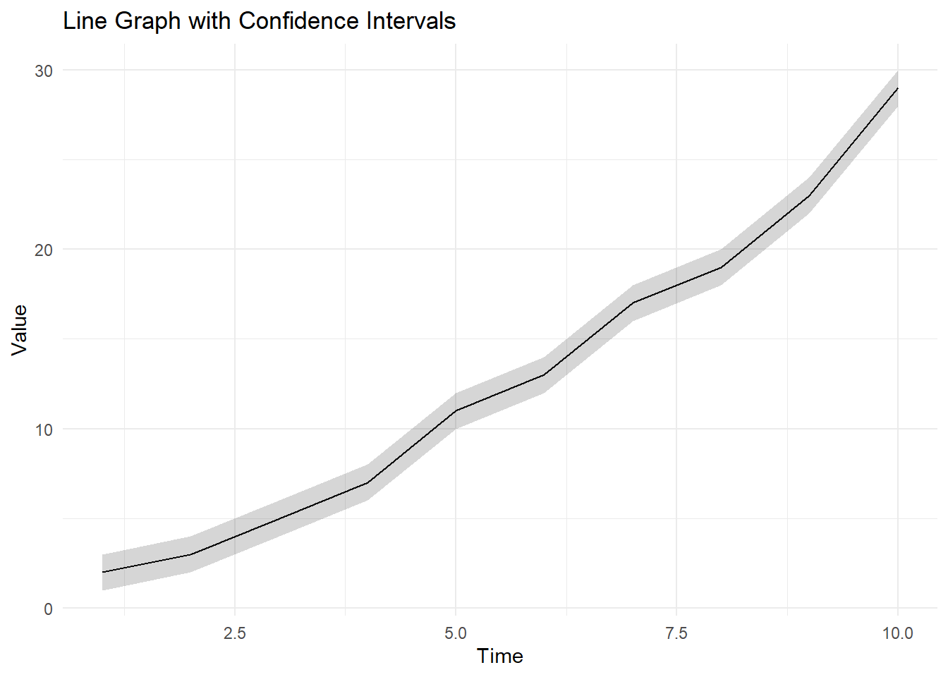
Line Graph with Confidence Intervals
Incorporating confidence intervals into a line graph can convey the variability and reliability of the data.
Code
# Create a sample dataset with confidence intervalsdata3<-data.frame( Time =1:10, Value =c(2, 3, 5, 7, 11, 13, 17, 19, 23, 29), Lower =c(1, 2, 4, 6, 10, 12, 16, 18, 22, 28), Upper =c(3, 4, 6, 8, 12, 14, 18, 20, 24, 30))# Create a line graph with confidence intervalsggplot(data3, aes(x =Time, y =Value))+geom_line()+geom_ribbon(aes(ymin =Lower, ymax =Upper), alpha =0.2)+labs(title ="Line Graph with Confidence Intervals", x ="Time", y ="Value")+theme_minimal()
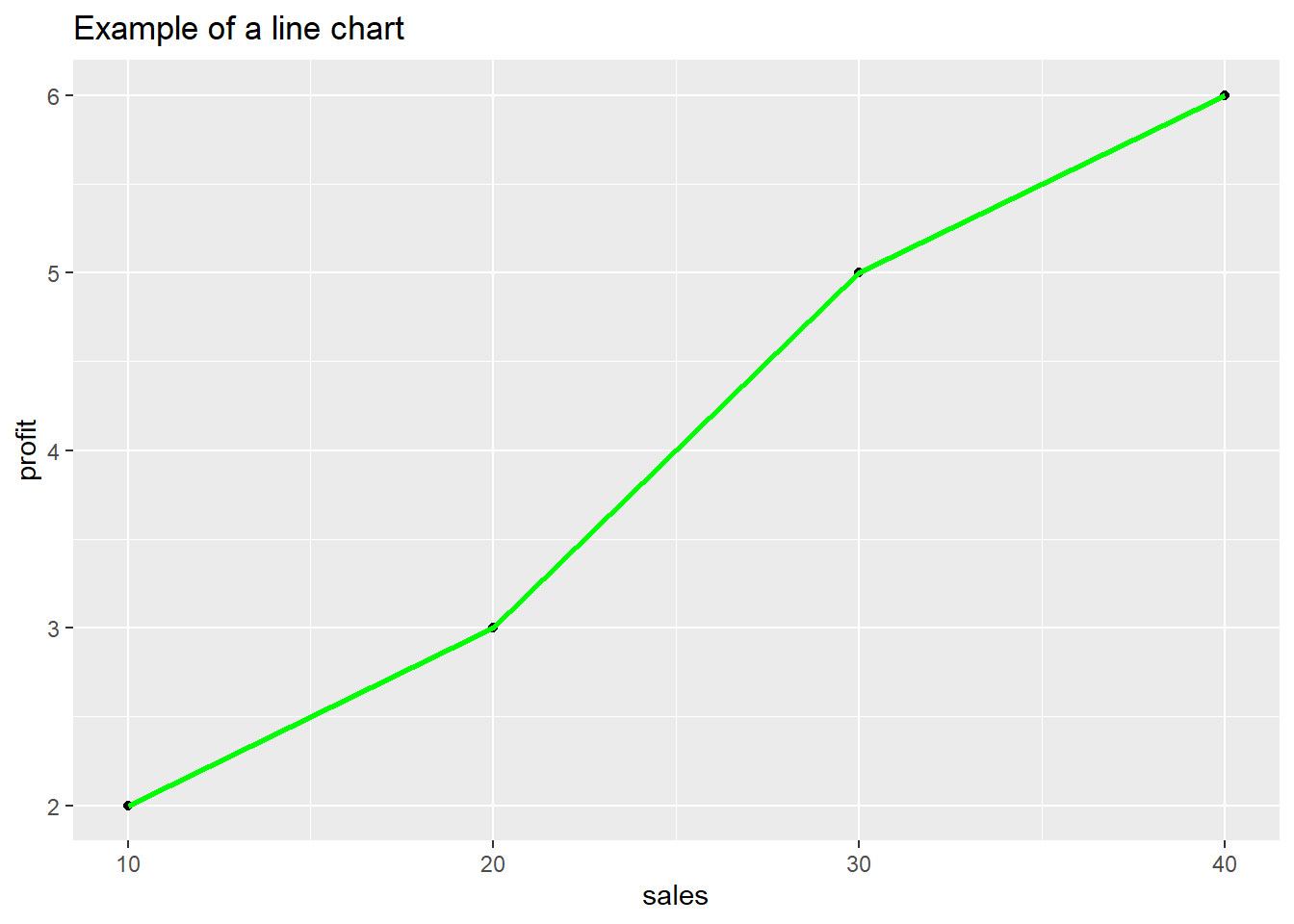
sales<-c(10,20,30,40)profit<-c(2,3,5,6)df<-tibble(sales,profit)df%>%ggplot(aes(sales,profit))+geom_point()+geom_line(color ="green", linewidth =1, size =3)+labs(title ="Example of a line chart")
Warning: Using `size` aesthetic for lines was deprecated in ggplot2 3.4.0.
ℹ Please use `linewidth` instead.
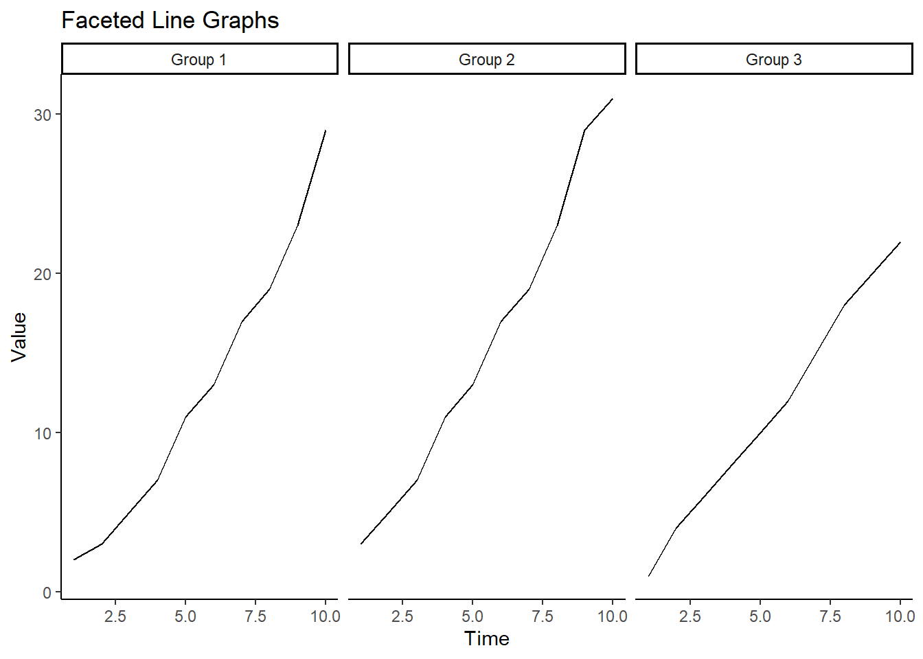
Faceting allows the creation of multiple panels of plots based on a categorical variable, making it easier to compare different subsets of the data.
Code
# Create a sample dataset with multiple groupsd4<-data.frame( Time =rep(1:10, 3), Value =c(2, 3, 5, 7, 11, 13, 17, 19, 23, 29,3, 5, 7, 11, 13, 17, 19, 23, 29, 31,1, 4, 6, 8, 10, 12, 15, 18, 20, 22), Group =rep(c("Group 1", "Group 2", "Group 3"), each =10))# Create a faceted line graphggplot(d4, aes(x =Time, y =Value))+geom_line()+facet_wrap(~Group)+labs(title ="Faceted Line Graphs", x ="Time", y ="Value")+theme_classic()
Interactive Line Graphs
Interactive line graphs enable users to explore data by hovering over points, zooming, and panning. The plotly package is used to create such interactive visualizations.
The following object is masked from 'package:ggplot2':

    last_plot
The following object is masked from 'package:stats':

    filter
The following object is masked from 'package:graphics':

    layout
Code
# Create an interactive line graphp<-ggplot(d4, aes(x =Time, y =Value, color =Group))+geom_line()+geom_point()+labs(title ="Interactive Line Graph", x ="Time", y ="Value", color ="Group")+theme_minimal()ggplotly(p)
Conclusion
Line graphs are important tools for visualizing trends over time and comparing multiple data series. By using R and the ggplot2 package, you can create a variety of line graphs to suit different analytical needs.