Pie charts are a popular tool in data visualization used to represent the proportions of different categories within a whole. They are simple, visually appealing, and effective for displaying relative sizes of data points.
Importance of Pie Charts
Representing Proportions: They provide a clear visual representation of how different categories contribute to the whole.
Simplifying Data: They make it easy to understand the composition of a dataset at a glance.
Highlighting Differences: They effectively highlight differences in proportions among categories.
Engaging Visuals: Their circular shape and colorful segments make them visually engaging and easy to interpret.
Use Cases
Market Share Analysis: Pie charts are commonly used to represent market share, showing the percentage of total sales or revenue each company contributes.
Budget Allocation: Pie charts effectively communicate how a budget is distributed among different expense categories.
Survey Responses: When presenting survey results, pie charts can illustrate the distribution of responses across various answer choices.
Best Practices for Pie Charts
Limit number of slices
Too many slices can make the chart cluttered and hard to read. ideally keep it to five or fewer categories
Use Distinct Colors Ensure each slice is easily distinguishable by useing distinct colors
Label Clearly Each slice should be clealry labeled with its category and percentage
Maintain Proportionality Ensures the size of the slices are accurately proportional to the values they represent
Consider Alternatives For datasets with many categories consider using other charts each bar chats
Creating Pie Charts in R
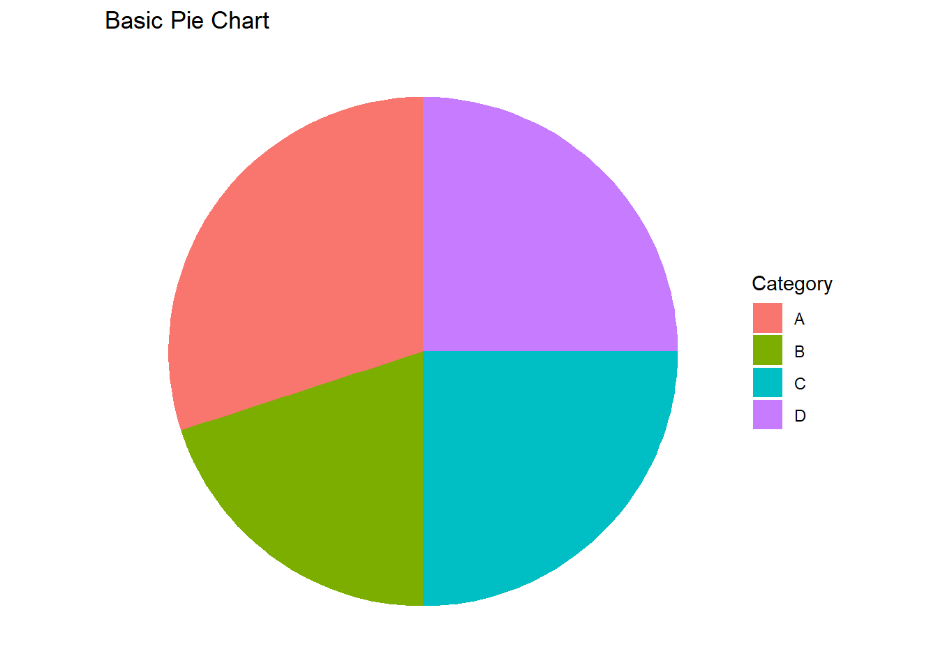
To create pie charts in R, we will use the ggplot2 package along with the ggpie extension. Let’s start with a basic pie chart and gradually explore more complex variations.
Code
library(tidyverse)# Create a sample datasetdata<-data.frame( Category =c("A", "B", "C", "D"), Value =c(30, 20, 25, 25))# Create a basic pie chartggplot(data, aes(x ="", y =Value, fill =Category))+geom_bar(width =1, stat ="identity")+coord_polar("y")+labs(title ="Basic Pie Chart")+theme_void()
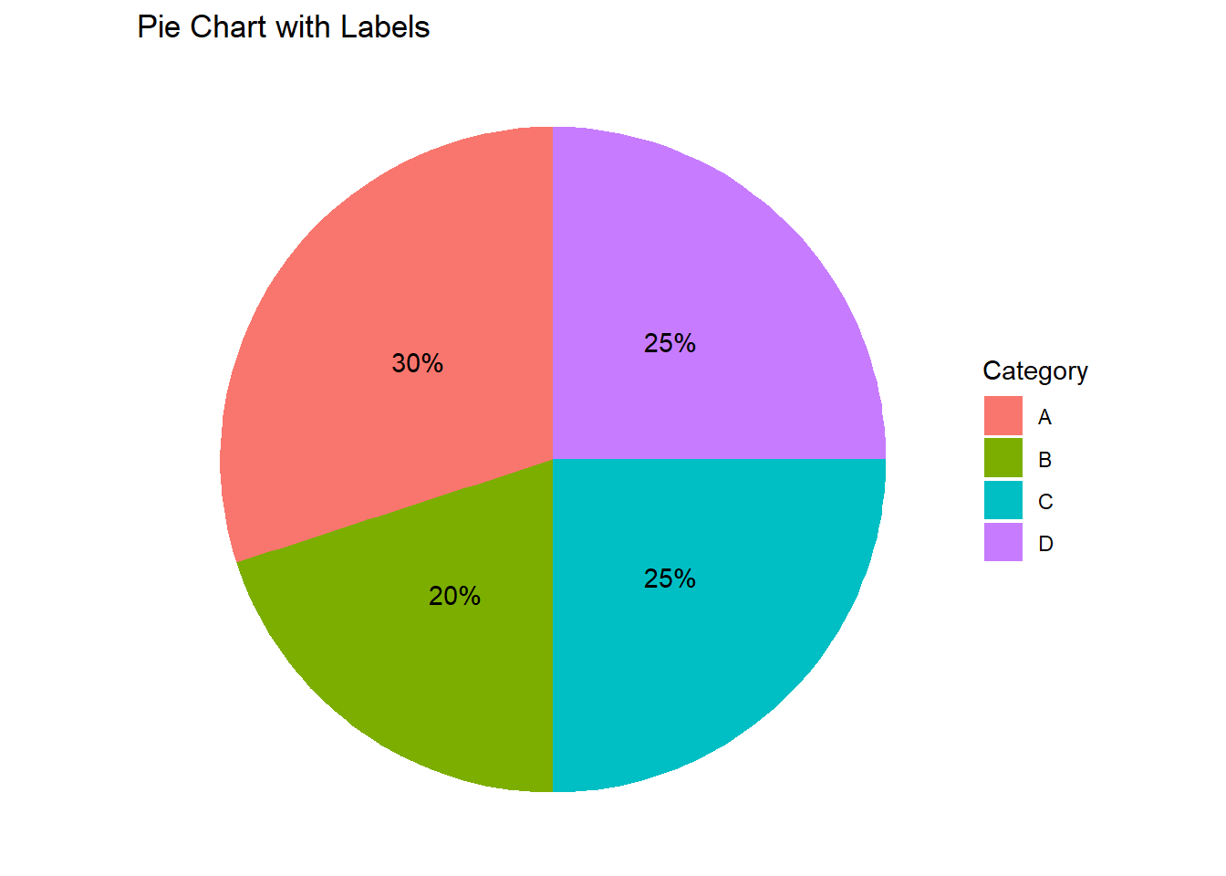
Pie Chart with Labels
Adding labels to a pie chart provides additional information about the proportions of each category.
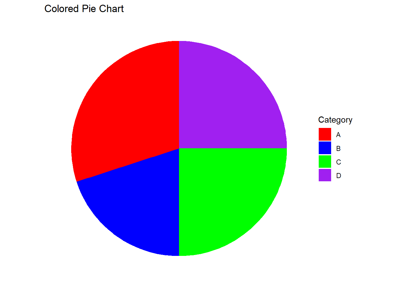
Using different colors for different categories enhances the visual distinction between segments.
Code
# Create a colored pie chartggplot(data, aes(x ="", y =Value, fill =Category))+geom_bar(width =1, stat ="identity")+coord_polar("y")+scale_fill_manual(values =c("red", "blue", "green", "purple"))+labs(title ="Colored Pie Chart")+theme_void()
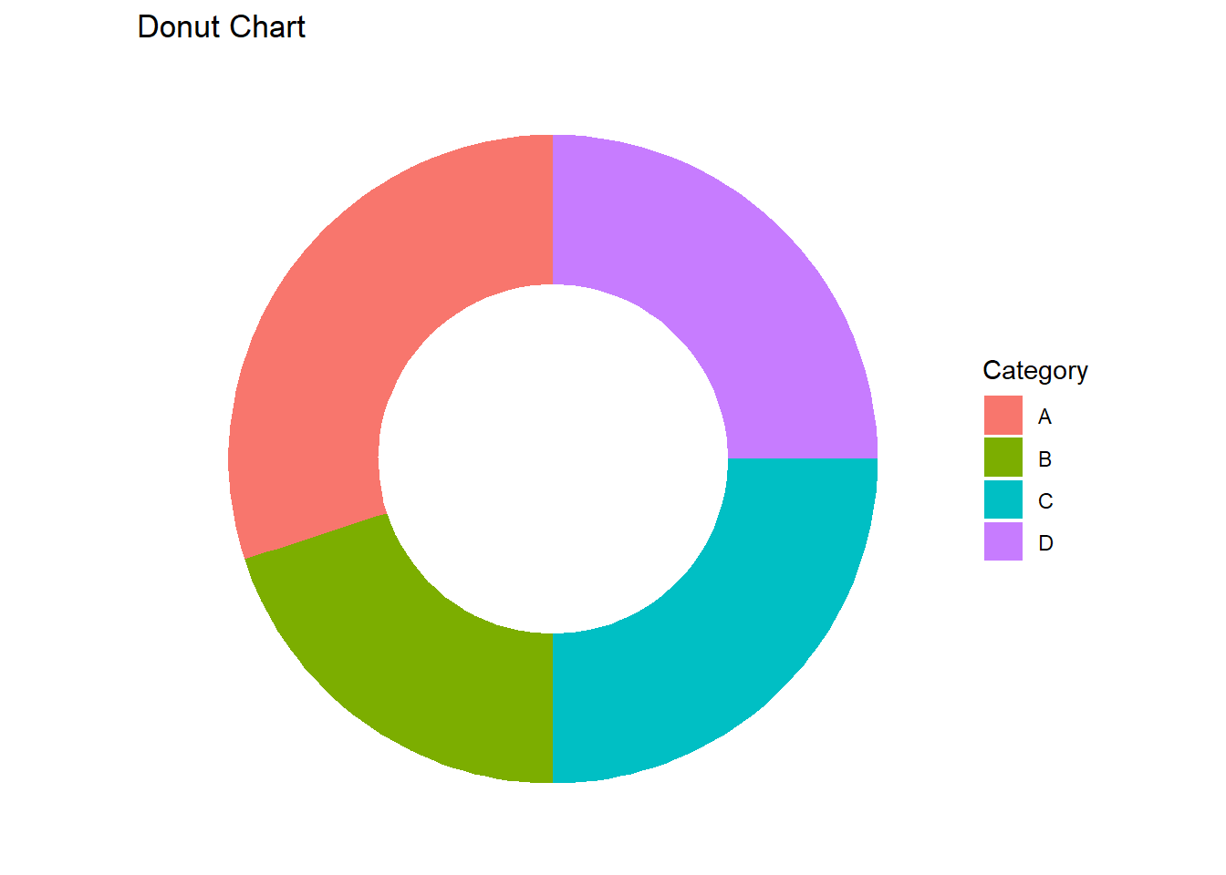
Donut Chart
A donut chart is a variation of a pie chart with a blank center, which can make it easier to compare the sizes of segments.
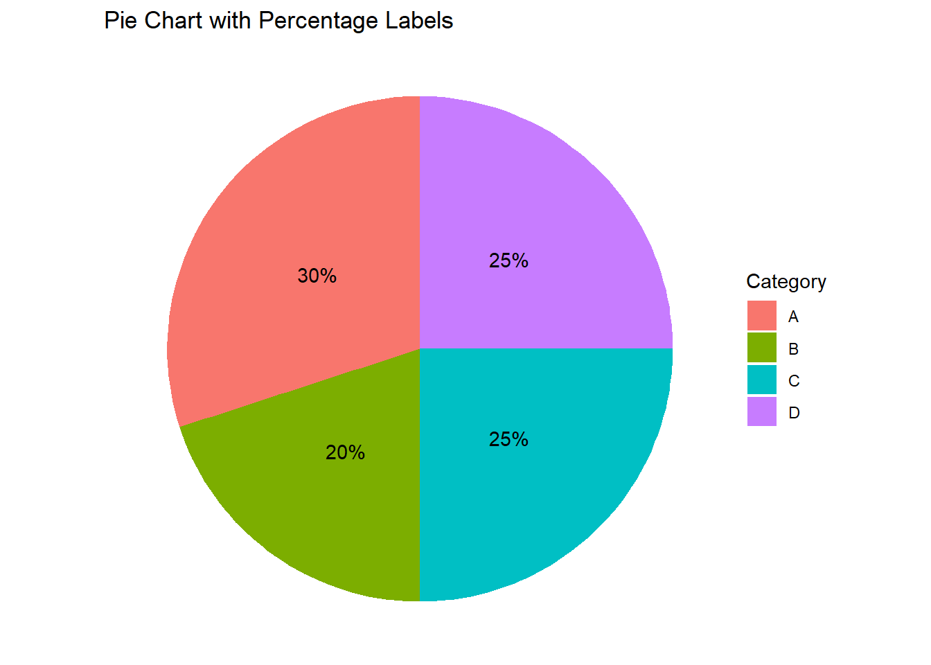
Displaying percentages on a pie chart helps to clearly communicate the proportion of each segment.
Code
# Create a pie chart with percentage labelsdata$Percentage<-round(data$Value/sum(data$Value)*100)ggplot(data, aes(x ="", y =Value, fill =Category))+geom_bar(width =1, stat ="identity")+coord_polar("y")+geom_text(aes(label =paste0(Percentage, "%")), position =position_stack(vjust =0.5))+labs(title ="Pie Chart with Percentage Labels")+theme_void()