Scatter plots are a fundamental tool in data visualization, used to display the relationship between two numerical variables. By plotting data points on a Cartesian plane, scatter plots help identify patterns, correlations, and outliers within a dataset. This article explores the importance of scatter plots, demonstrates how to create them using R, and showcases several variations to highlight their versatility.
Importance of Scatter Plots
Identifying Relationships: They reveal relationships or correlations between two numerical variables.
Detecting Patterns: They help detect patterns, trends, and clusters in the data.
Spotting Outliers: They make it easy to identify outliers that deviate significantly from the overall trend.
Visualizing Distribution: They provide insights into the distribution and spread of data points.
Creating Scatter Plots in R
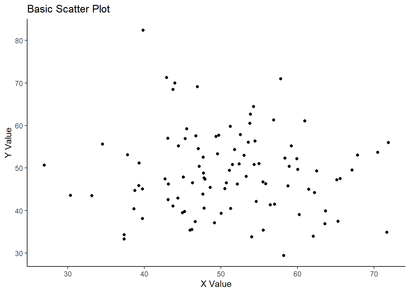
Basic Scatter Plot
A basic scatter plot displays the relationship between two numerical variables.
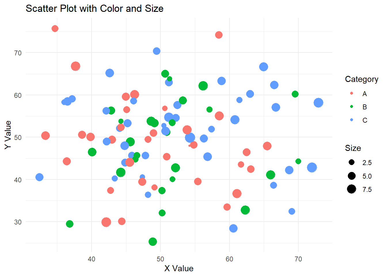
Adding color and size to data points can provide additional information about other variables.
Code
# Create a sample dataset with additional variablesdata2<-data.frame( X =rnorm(100, mean =50, sd =10), Y =rnorm(100, mean =50, sd =10), Category =sample(c("A", "B", "C"), 100, replace =TRUE), Size =rnorm(100, mean =5, sd =2))# Create a scatter plot with color and sizeggplot(data2, aes(x =X, y =Y, color =Category, size =Size))+geom_point()+labs(title ="Scatter Plot with Color and Size", x ="X Value", y ="Y Value", color ="Category", size ="Size")+theme_minimal()
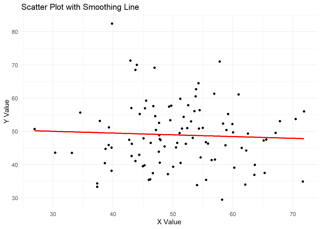
Scatter Plot with Smoothing Line
Adding a smoothing line to a scatter plot helps visualize the overall trend in the data.
Code
# Create a scatter plot with a smoothing lineggplot(data, aes(x =X, y =Y))+geom_point()+geom_smooth(method ="lm", se =FALSE, color ="red")+labs(title ="Scatter Plot with Smoothing Line", x ="X Value", y ="Y Value")+theme_minimal()
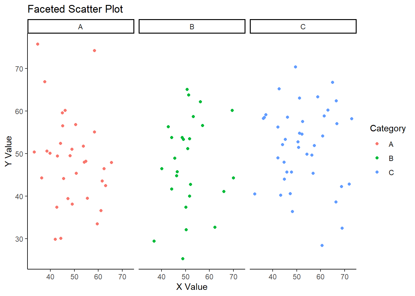
Faceted Scatter Plot
Faceting allows the creation of multiple panels of scatter plots based on the values of a categorical variable, making it easier to compare different subsets of the data.
Code
# Create a faceted scatter plotggplot(data2, aes(x =X, y =Y, color =Category))+geom_point()+facet_wrap(~Category)+labs(title ="Faceted Scatter Plot", x ="X Value", y ="Y Value", color ="Category")+theme_classic()
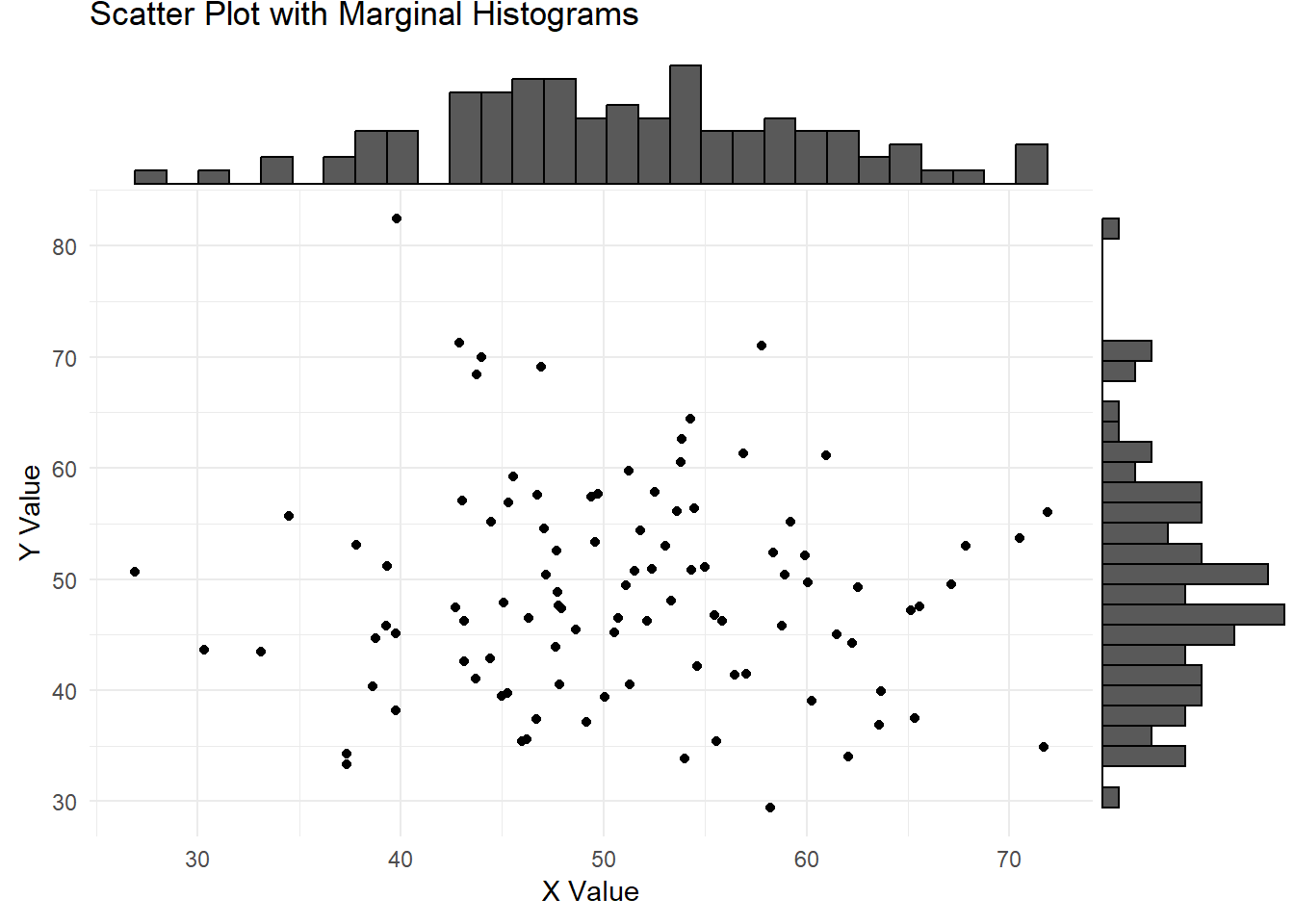
Scatter Plot with Marginal Histograms
Adding marginal histograms to a scatter plot provides additional information about the distribution of each variable.
The following object is masked from 'package:ggplot2':

    last_plot
The following object is masked from 'package:stats':

    filter
The following object is masked from 'package:graphics':

    layout
Code
# Create an interactive scatter plotp<-ggplot(data2, aes(x =X, y =Y, color =Category, size =Size))+geom_point()+labs(title ="Interactive Scatter Plot", x ="X Value", y ="Y Value", color ="Category", size ="Size")+theme_minimal()ggplotly(p)