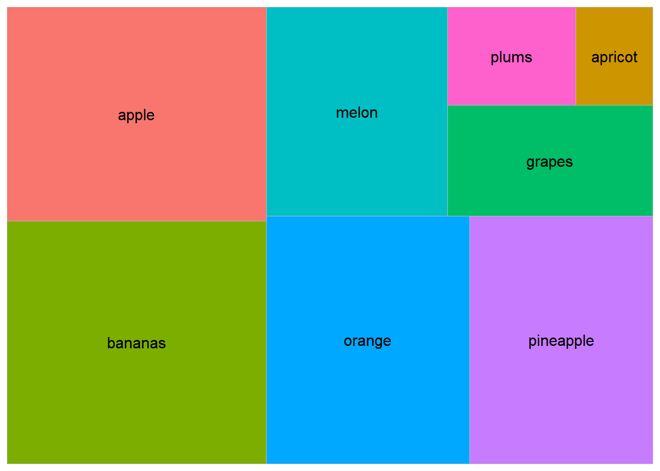
Treemaps are a powerful visualization tool used to display hierarchical data using nested rectangles. Each rectangle represents a category, with the size and color of the rectangles representing additional variables.
Importance of Treemaps
Visualizing Hierarchies: They effectively display hierarchical structures, showing the relationship between parent and child categories.
Comparing Proportions: They allow for easy comparison of the relative sizes of different categories.
Utilizing Space: They make efficient use of space, allowing a large amount of data to be displayed in a compact area.
Highlighting Patterns: They help identify patterns and trends within hierarchical data.
Creating Treemaps in R
To create treemaps in R, we will use the treemap package. Let’s start with a basic treemap and gradually explore more complex variations.
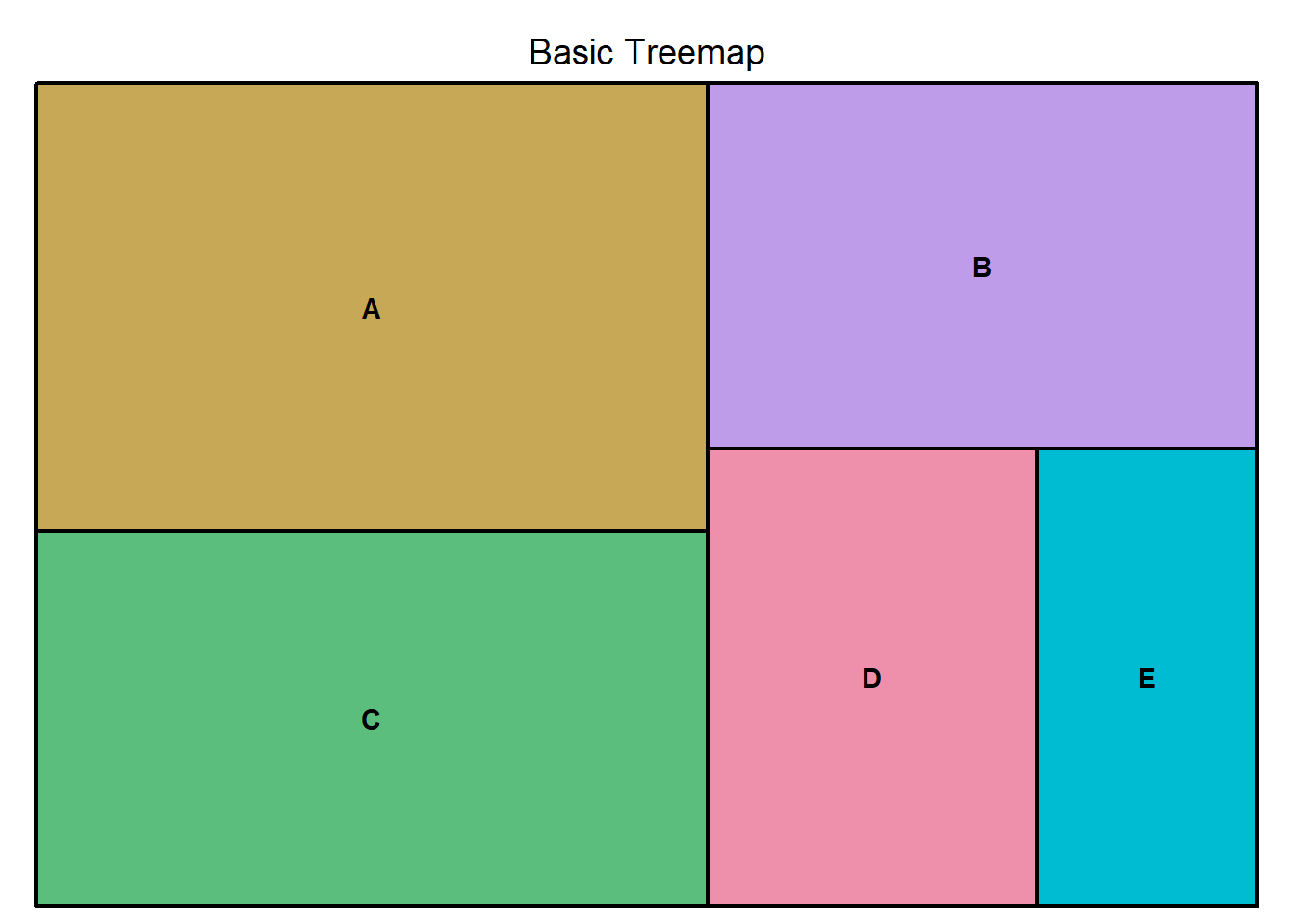
Basic Treemap
A basic treemap displays hierarchical data with rectangles sized according to a specified variable.
Code
library(treemap)# Create a sample datasetdata<-data.frame( Category =c("A", "B", "C", "D", "E"), Value =c(30, 20, 25, 15, 10))# Create a basic treemaptreemap(data, index ="Category", vSize ="Value", title ="Basic Treemap")
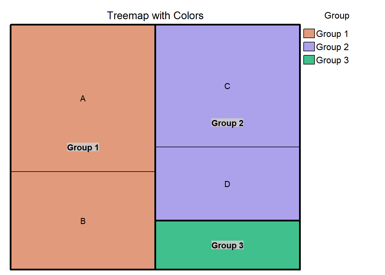
Treemap with Colors
Adding colors to a treemap can provide additional information about the categories.
Code
# Create a sample dataset with additional variablesdata<-data.frame( Category =c("A", "B", "C", "D", "E"), Value =c(30, 20, 25, 15, 10), Group =c("Group 1", "Group 1", "Group 2", "Group 2", "Group 3"))# Create a treemap with colorstreemap(data, index =c("Group", "Category"), vSize ="Value", vColor ="Group", type ="categorical", title ="Treemap with Colors")
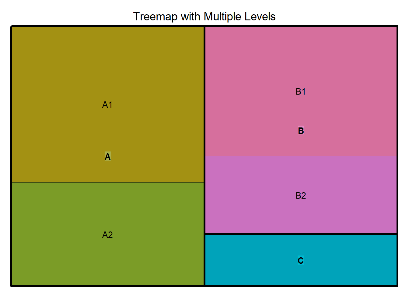
Treemap with Multiple Levels
Treemaps can display multiple levels of hierarchy, providing a detailed view of nested categories.
Code
# Create a sample dataset with multiple levelsdata2<-data.frame( Level1 =c("A", "A", "B", "B", "C"), Level2 =c("A1", "A2", "B1", "B2", "C1"), Value =c(30, 20, 25, 15, 10))# Create a treemap with multiple levelstreemap(data2, index =c("Level1", "Level2"), vSize ="Value", title ="Treemap with Multiple Levels")
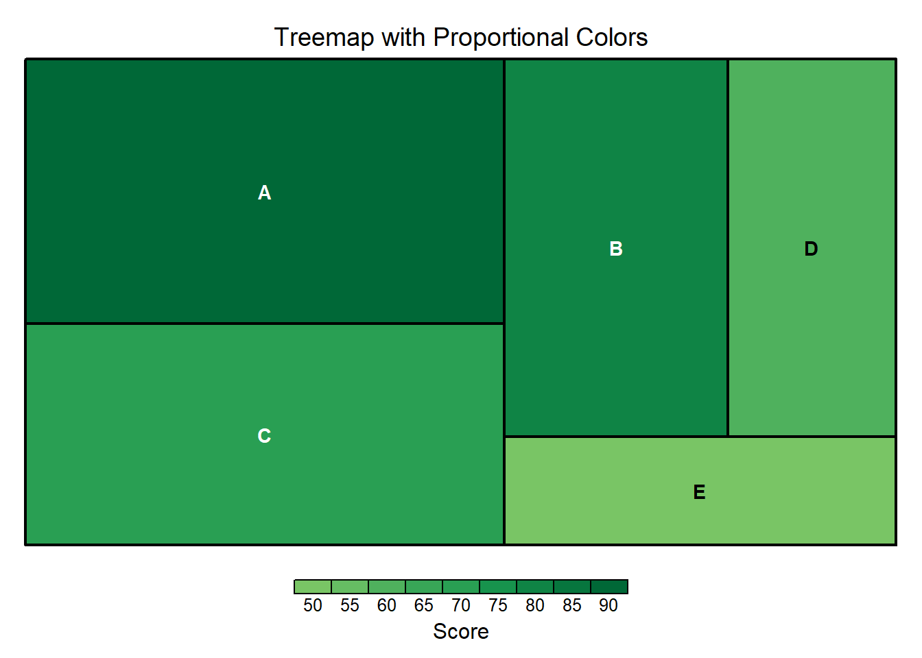
Treemap with Proportional Colors
Using proportional colors to represent an additional variable can provide deeper insights into the data.
Code
# Create a sample dataset with an additional variabledata<-data.frame( Category =c("A", "B", "C", "D", "E"), Value =c(30, 20, 25, 15, 10), Score =c(90, 80, 70, 60, 50))# Create a treemap with proportional colorstreemap(data, index ="Category", vSize ="Value", vColor ="Score", type ="value", title ="Treemap with Proportional Colors", palette ="RdYlGn")