Waterfall charts are a powerful tool for visualizing the cumulative effect of sequentially introduced positive or negative values. They are especially useful for understanding how an initial value is affected by a series of intermediate positive or negative changes.
Importance of Waterfall Charts
Visualizing Changes Over Time
They clearly show how an initial value is incrementally increased or decreased by a series of changes.
Highlighting Key Drivers
They help identify and emphasize the key drivers of change within a dataset.
Comparing Contributions
They allow for easy comparison of the contributions of different factors to the overall change.
Simplifying Complex Data
They simplify complex data into a straightforward visual format that is easy to interpret.
Identifying Key Drivers:
Waterfall charts are invaluable for identifying the key drivers behind a change in a given metric. Whether it’s understanding the components of revenue growth, expense breakdowns, or project cost allocation, the waterfall chart offers a comprehensive view of the factors influencing the final value.
Scenario Analysis and Forecasting:
The versatility of waterfall charts extends to scenario analysis and forecasting. By manipulating the values of individual bars, users can simulate different scenarios and assess the potential impact on the total. This makes waterfall charts a valuable tool in decision-making and planning processes.
Enhancing Storytelling in Presentations:
Waterfall charts are not just analytical tools; they are also effective storytelling devices. Whether in boardroom presentations, financial reports, or project updates, the dynamic flow of a waterfall chart captivates audiences and simplifies the communication of complex data narratives.
Creating Waterfall Charts in R
To create waterfall charts in R, we will use the waterfall package.
Code
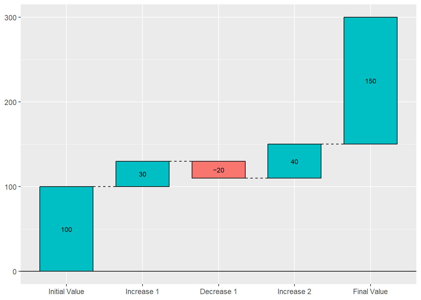
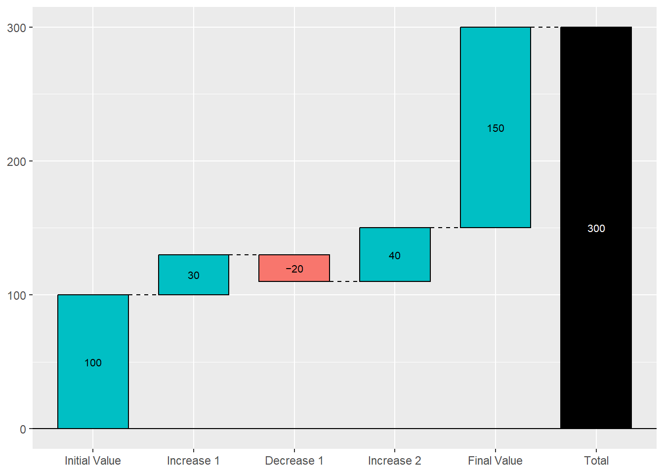
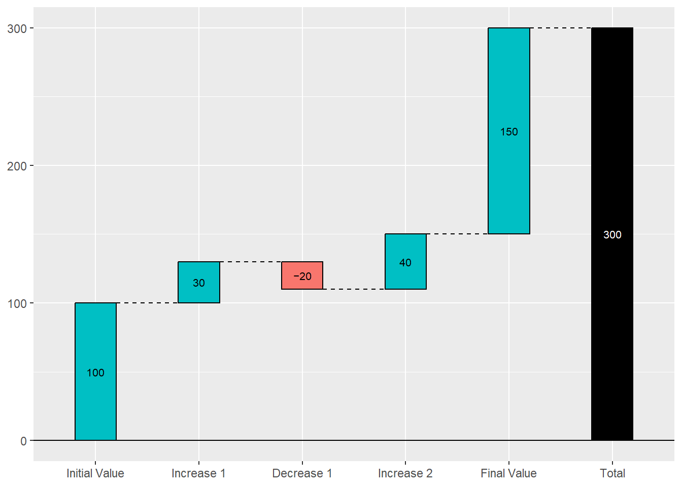
library(waterfalls)# Create a sample datasetdata<-data.frame( Category =c("Initial Value", "Increase 1", "Decrease 1", "Increase 2", "Final Value"), Value =c(100, 30, -20, 40, 150))# Create a basic waterfall chartwaterfall(data, fill_by_sign =TRUE)
Waterfall charts offer a unique perspective on data dynamics, enabling clear visualization of cumulative effects, transitions, and contributions. Whether analyzing financial data, project budgets, or performance metrics, the versatility and clarity of waterfall charts make them indispensable tools in data analysis and decision-making processes. Incorporating waterfall charts into your analytical toolkit can enhance your ability to communicate insights and drive impactful outcomes in various domains.